Rodney Strong
PACKAGE DESIGN
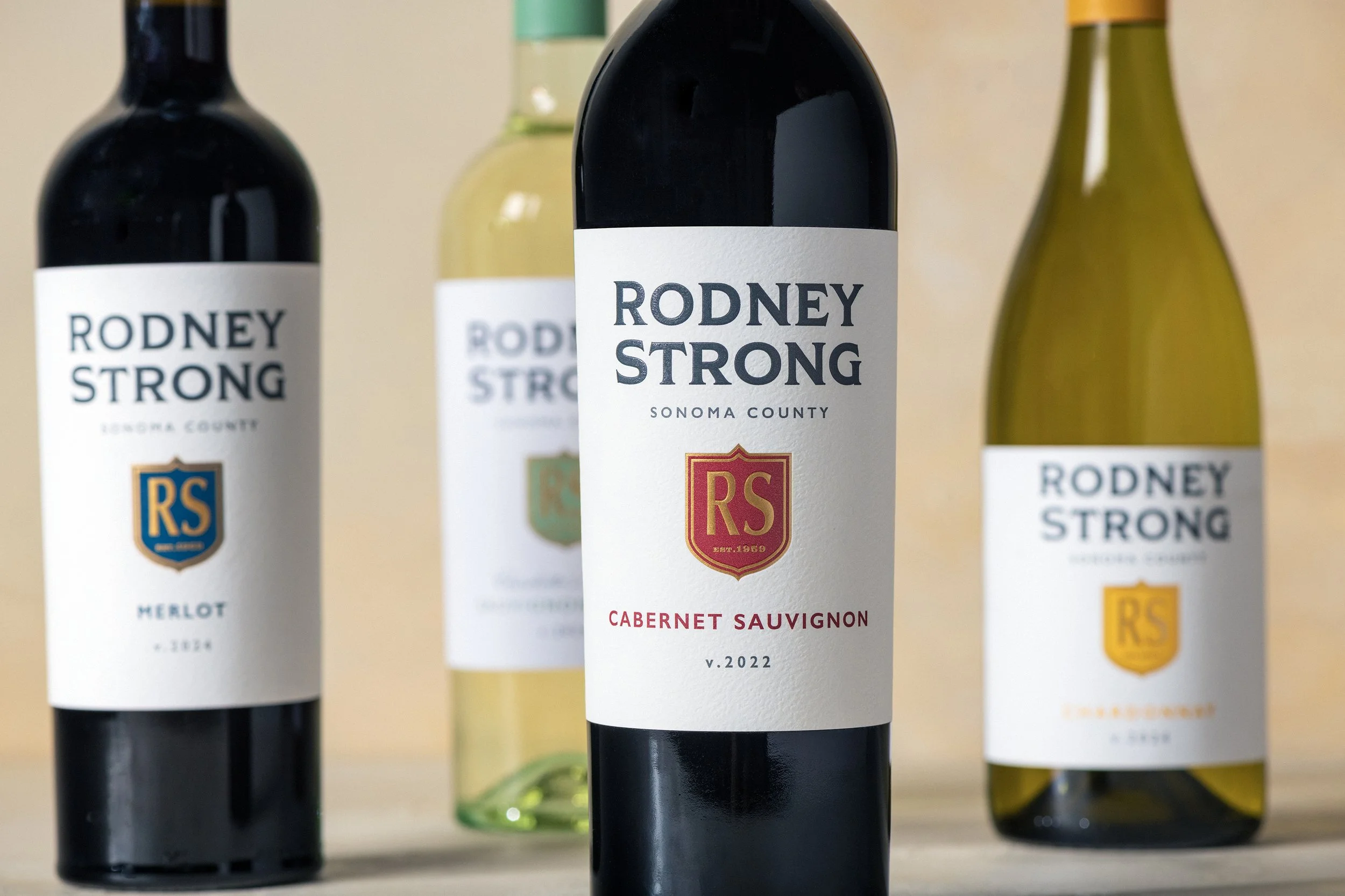
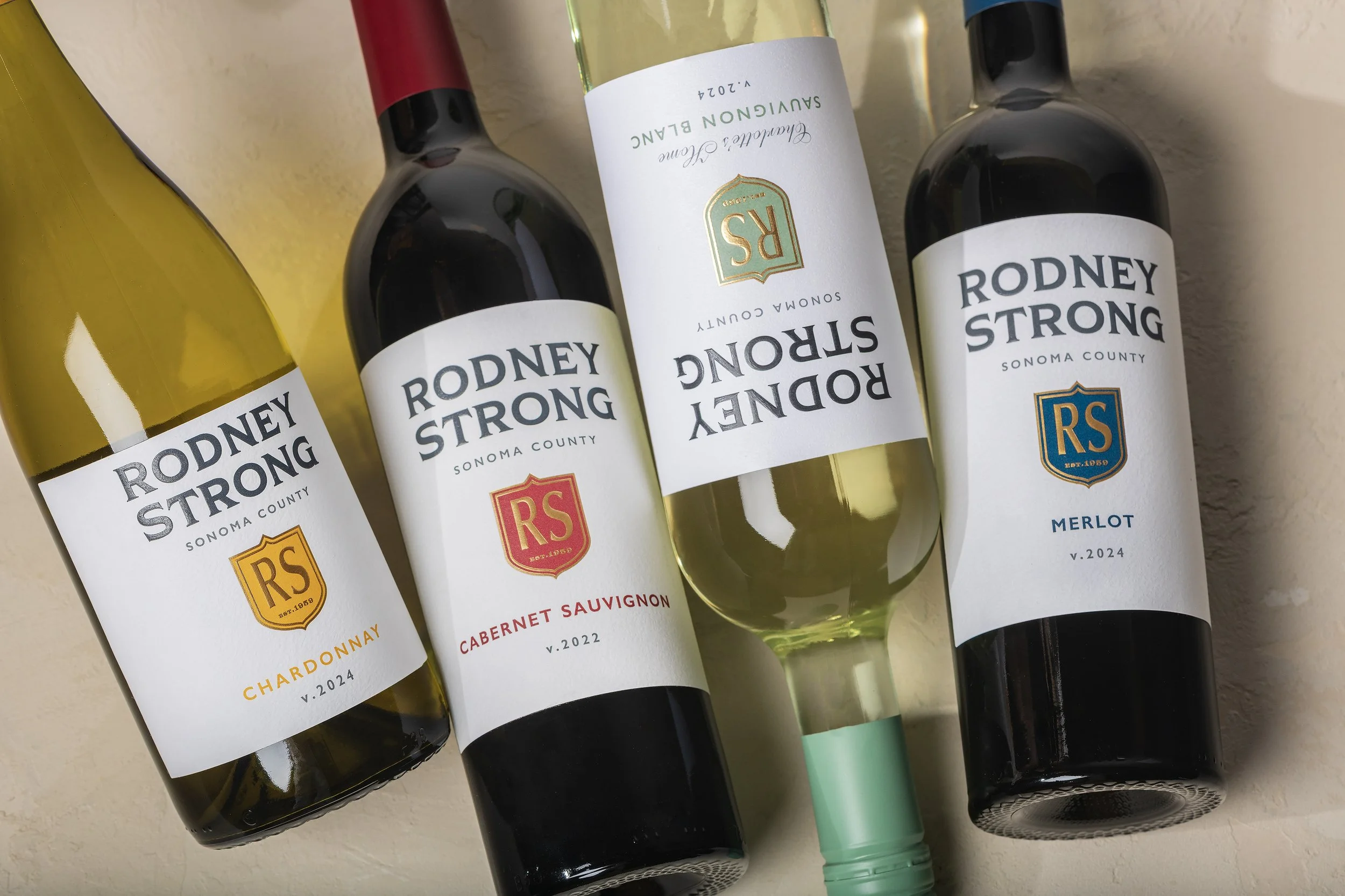
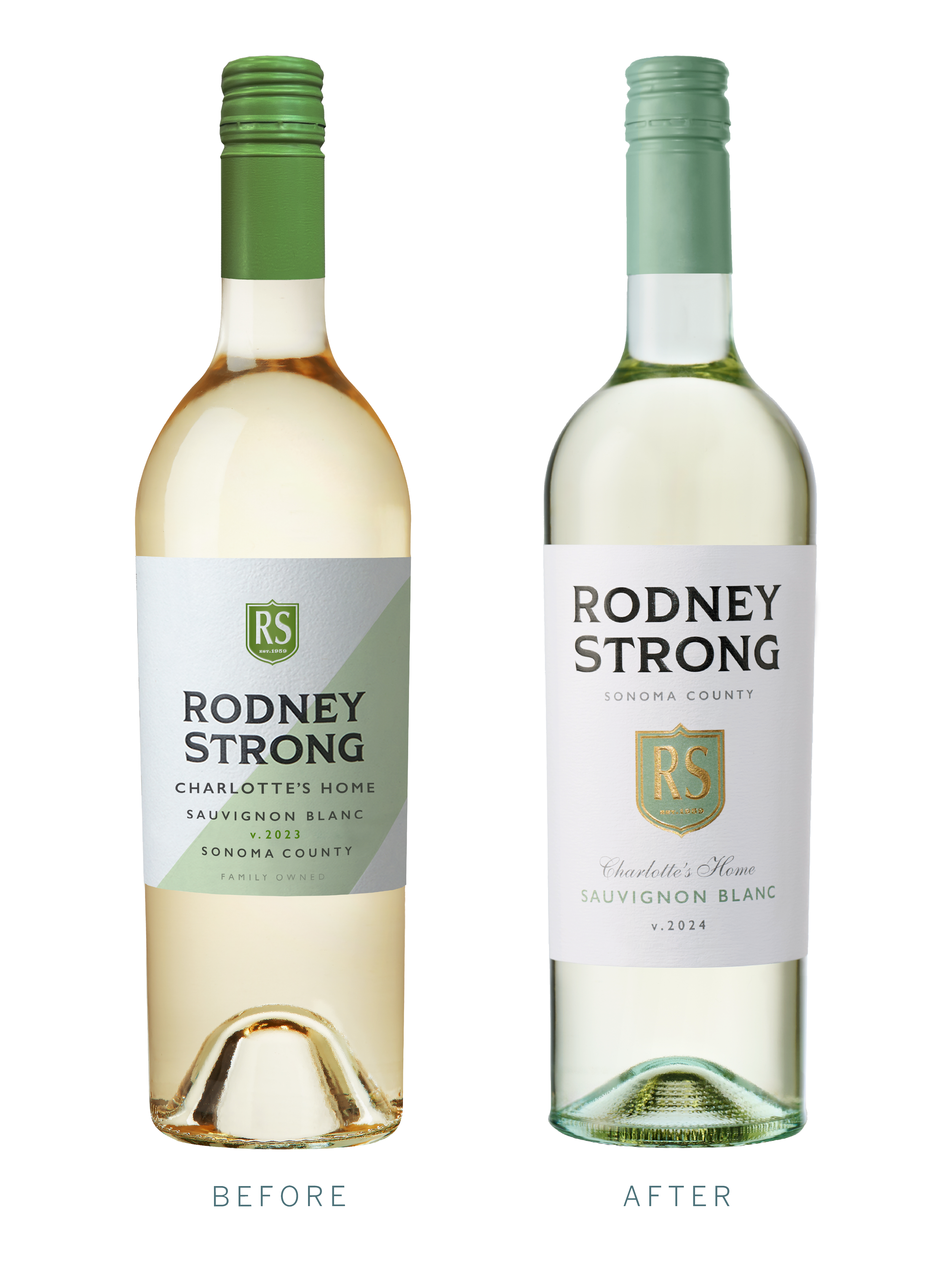
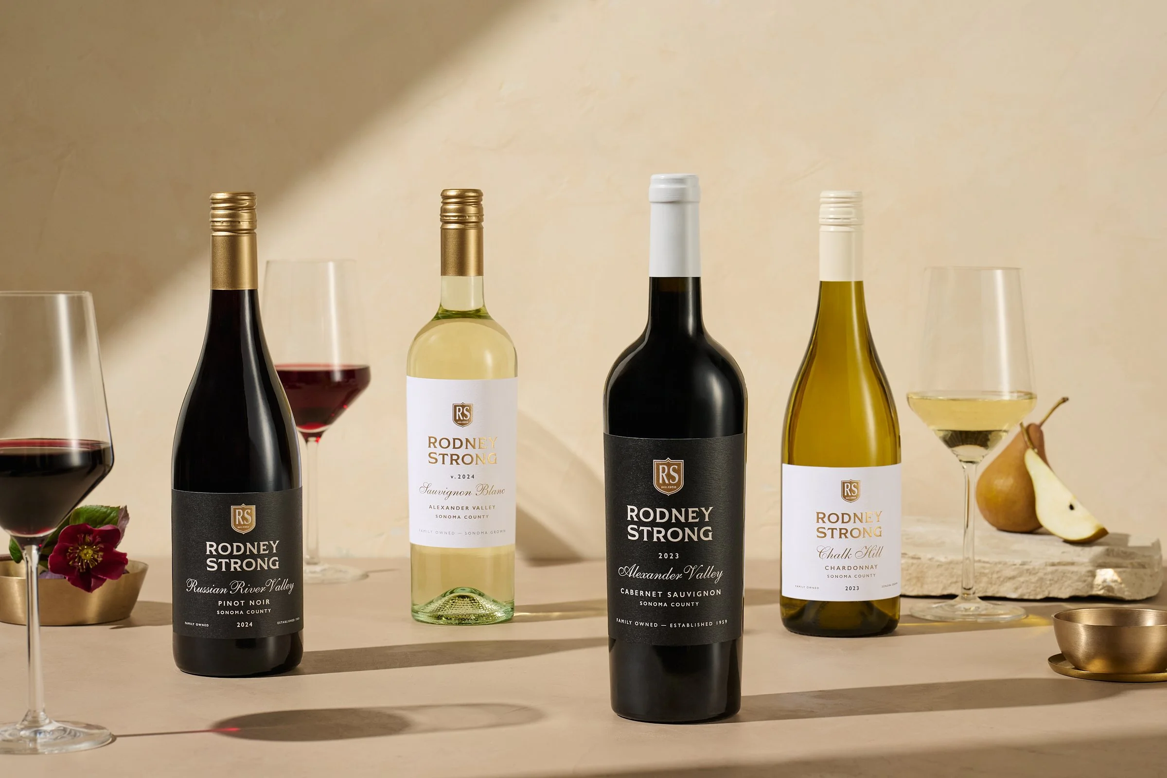
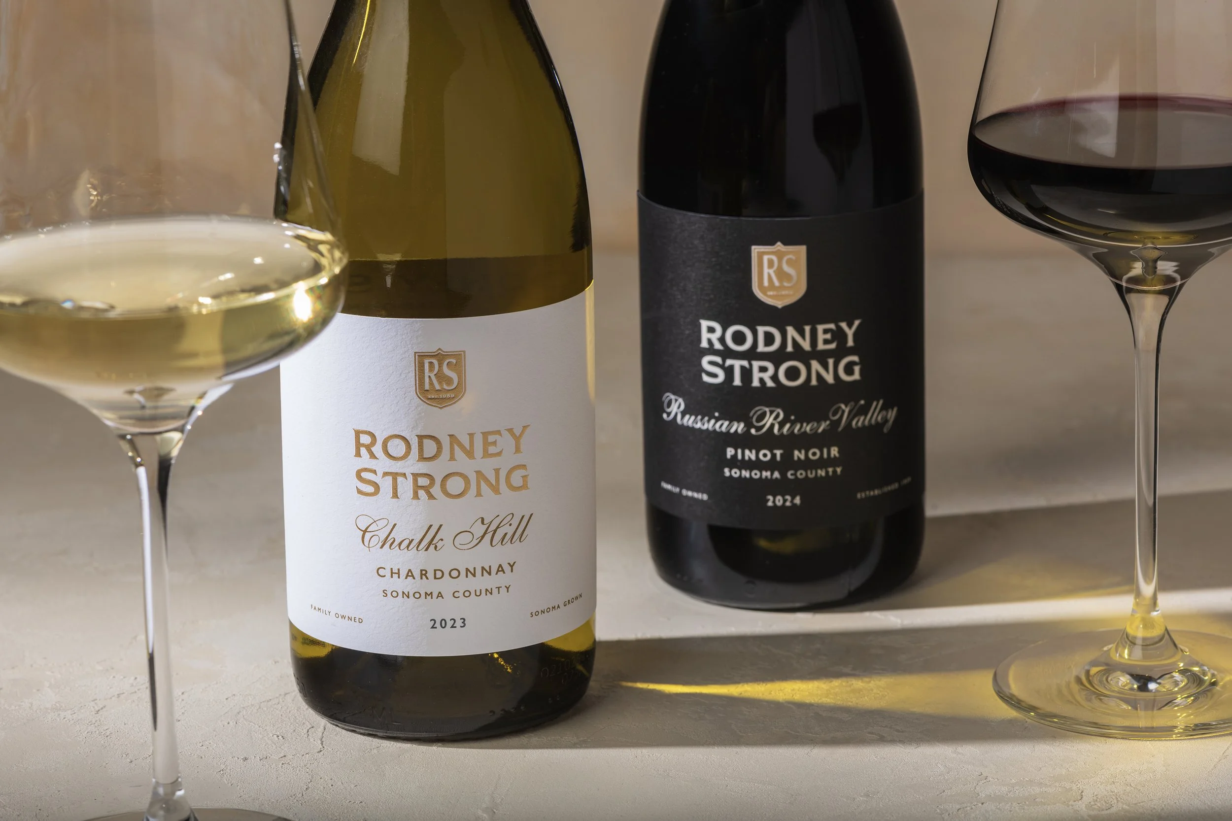
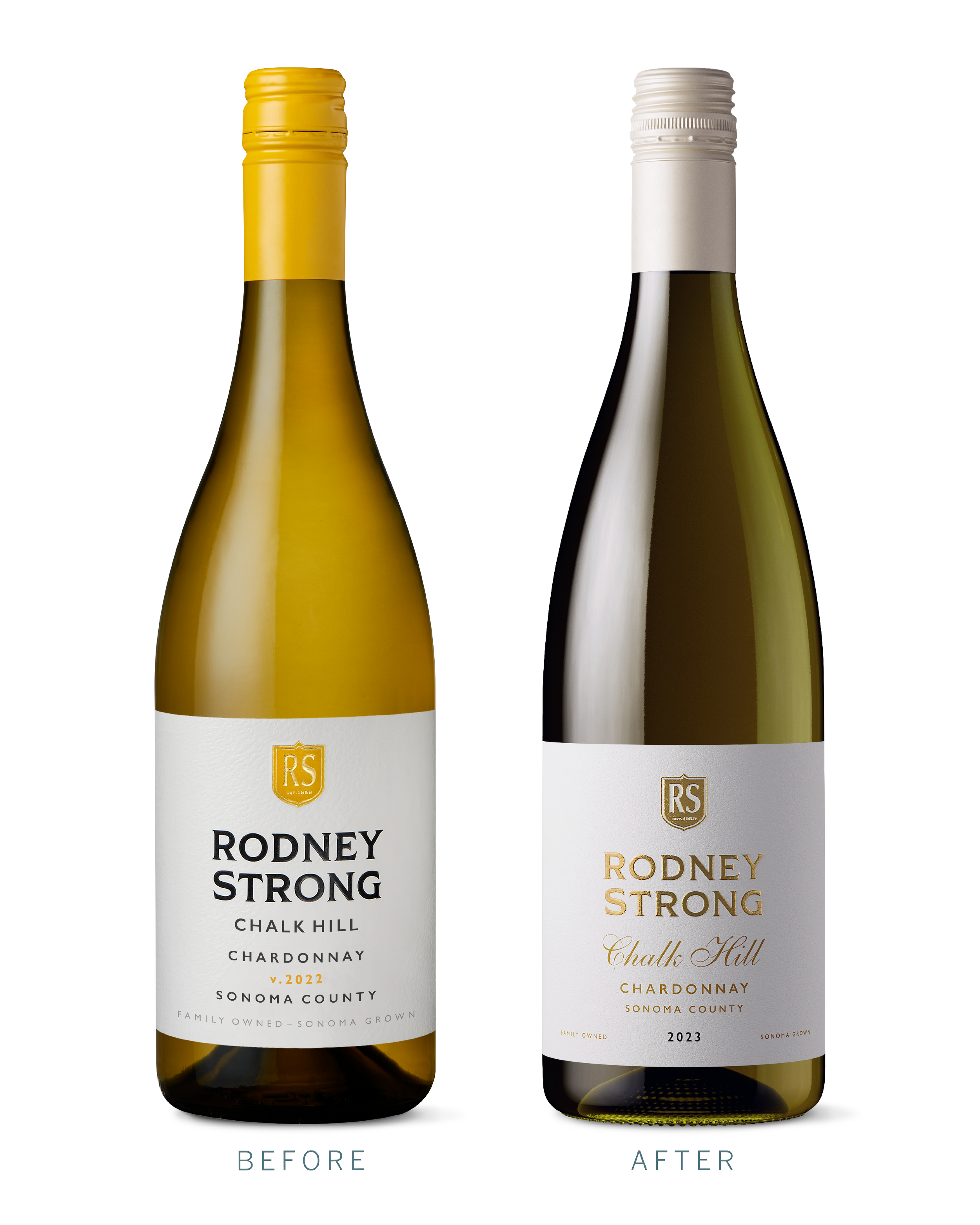
For a name as recognizable as Rodney Strong, evolution is about knowing what to keep and where to make an impact. We refreshed the Sonoma Core collection with refined typography and a stronger visual hierarchy, bringing greater clarity and consistency across the tier while preserving the brand’s established identity.
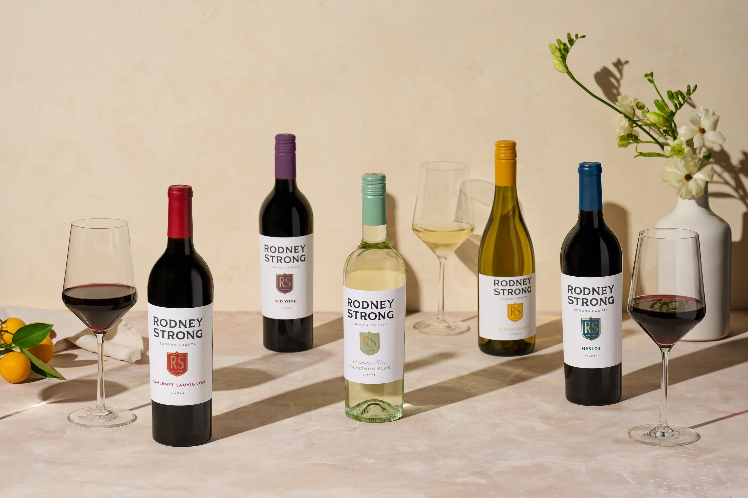
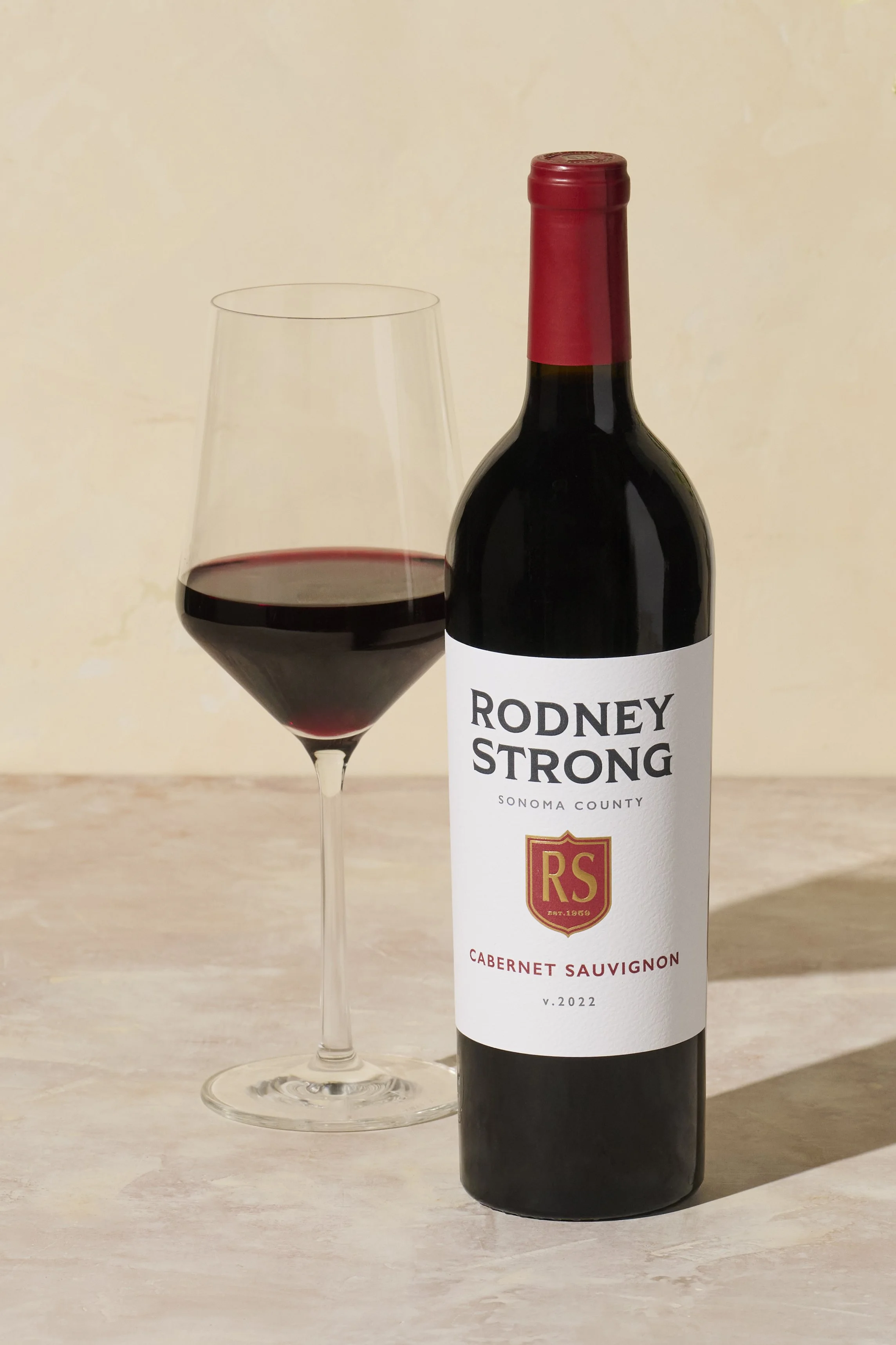
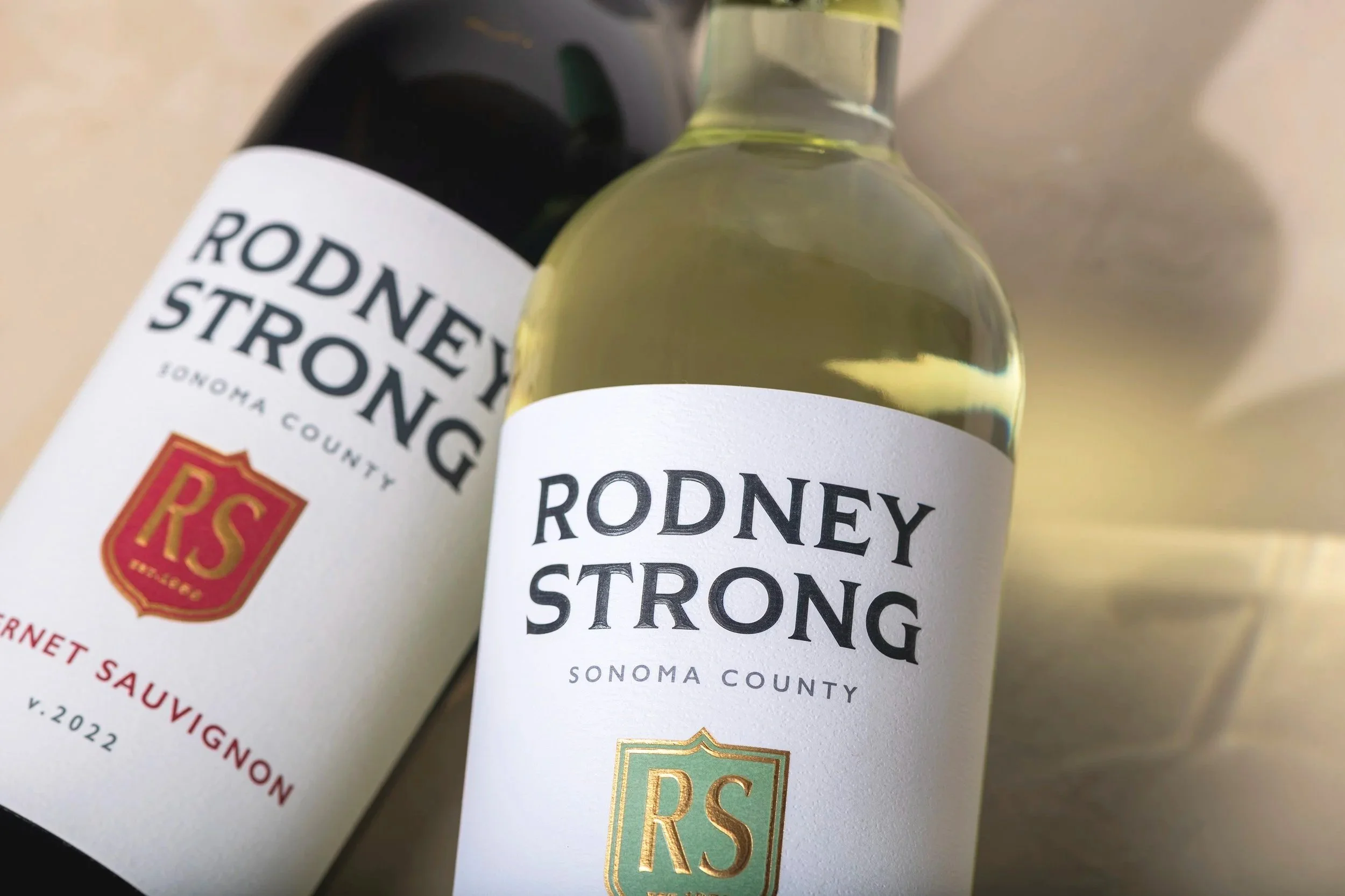
The result is a familiar face with a fresh perspective, designed to stand out on shelf and appeal to longtime loyalists and new audiences alike.
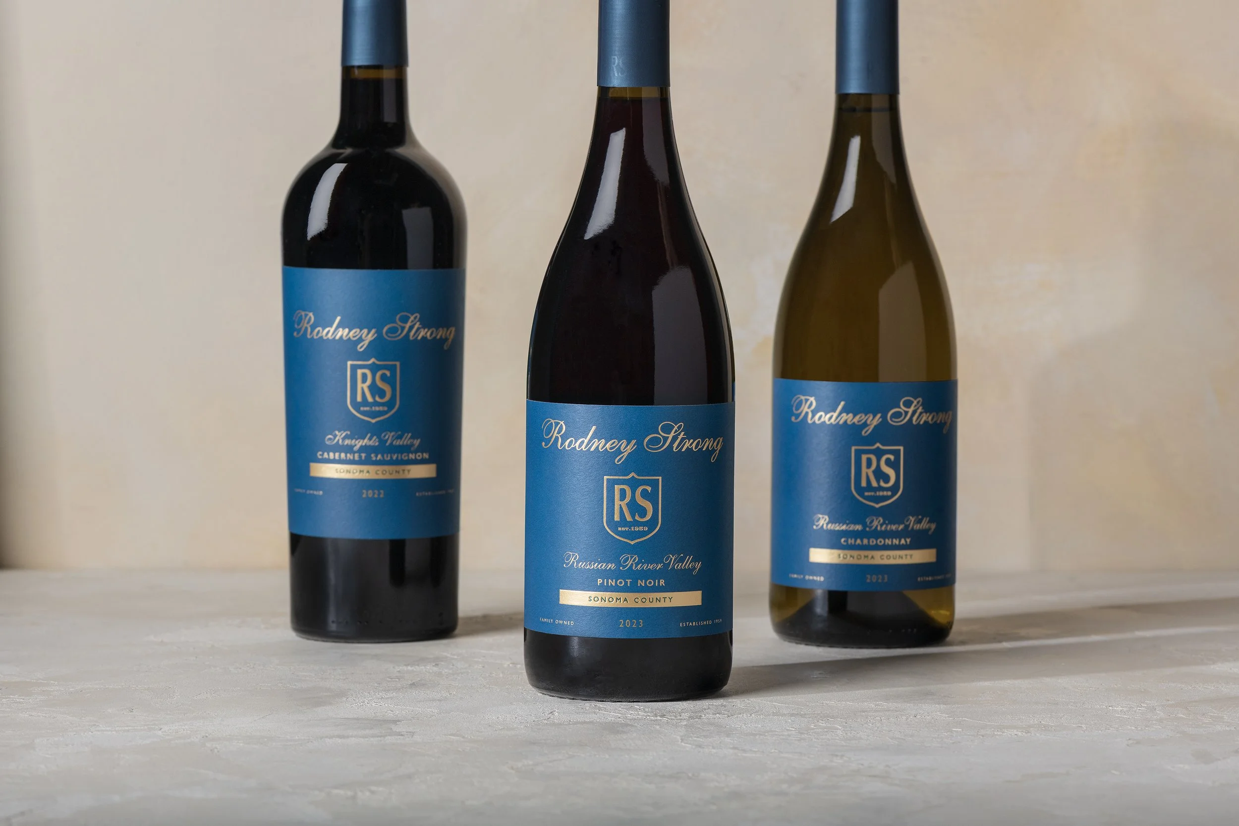
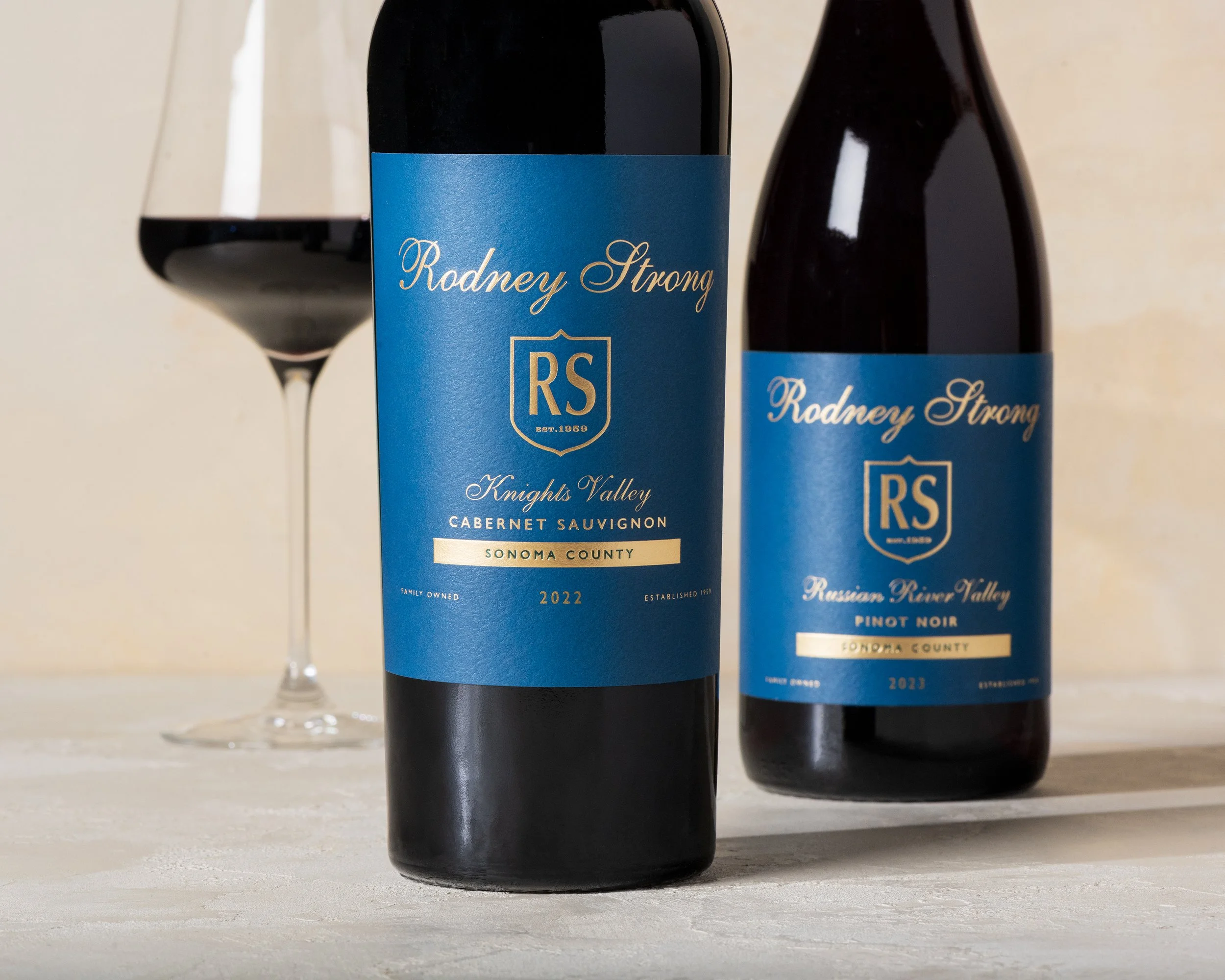
Rodney Strong’s Limited Collection brings together small-production wines from some of Sonoma County’s most exceptional vineyard sites. With this new addition to the portfolio, our goal was to create a sophisticated identity that establishes its own place between the Estates and Reserve collections.
Embracing one of Rodney Strong’s original brand colors, we saw an opportunity to bring its signature blue into the spotlight, giving it new life through a fresh, contemporary treatment. A script wordmark inspired by the Reserve wines creates a subtle connection to the broader portfolio.
The result is a distinctive, elevated expression that feels entirely and unmistakably Rodney Strong.
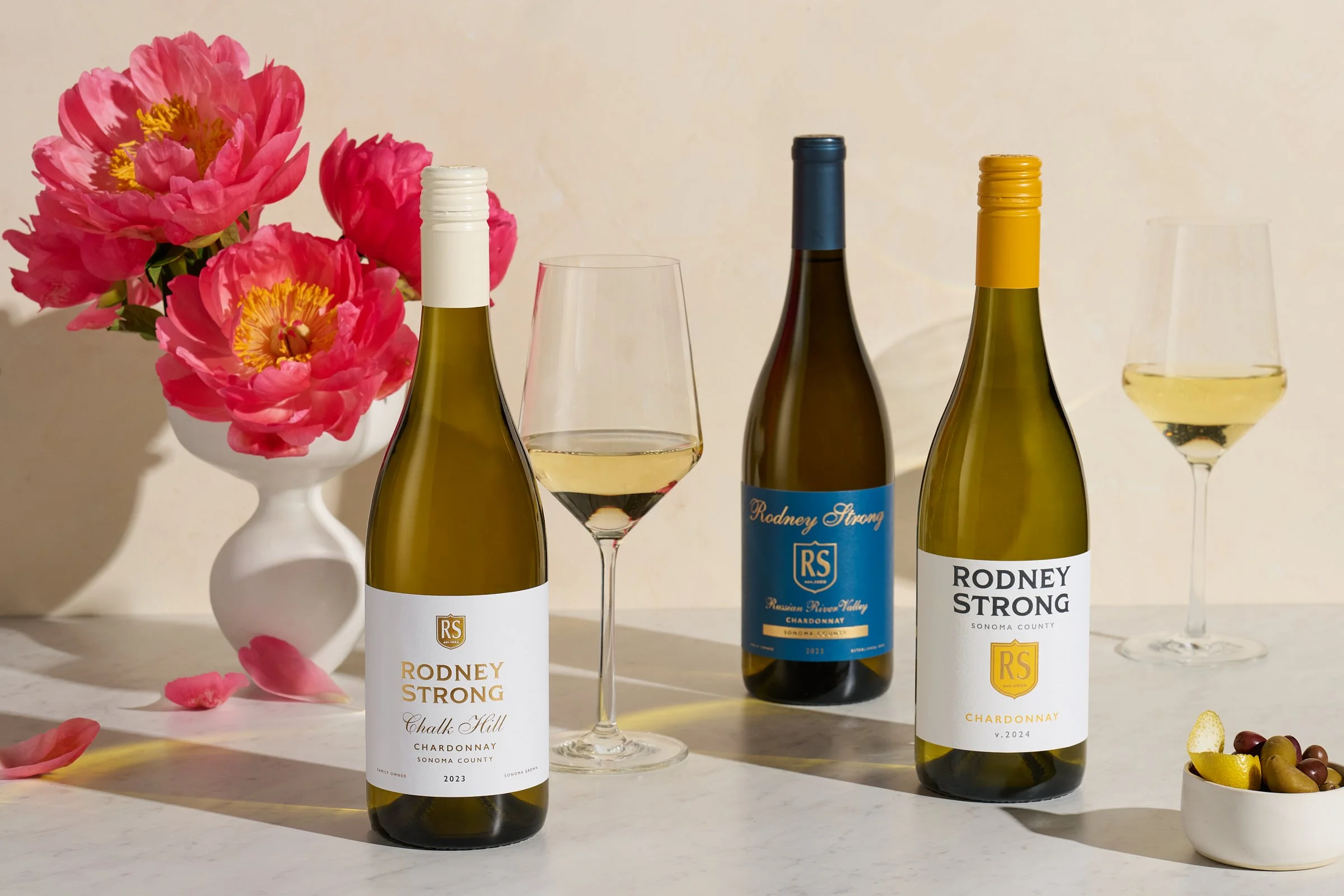
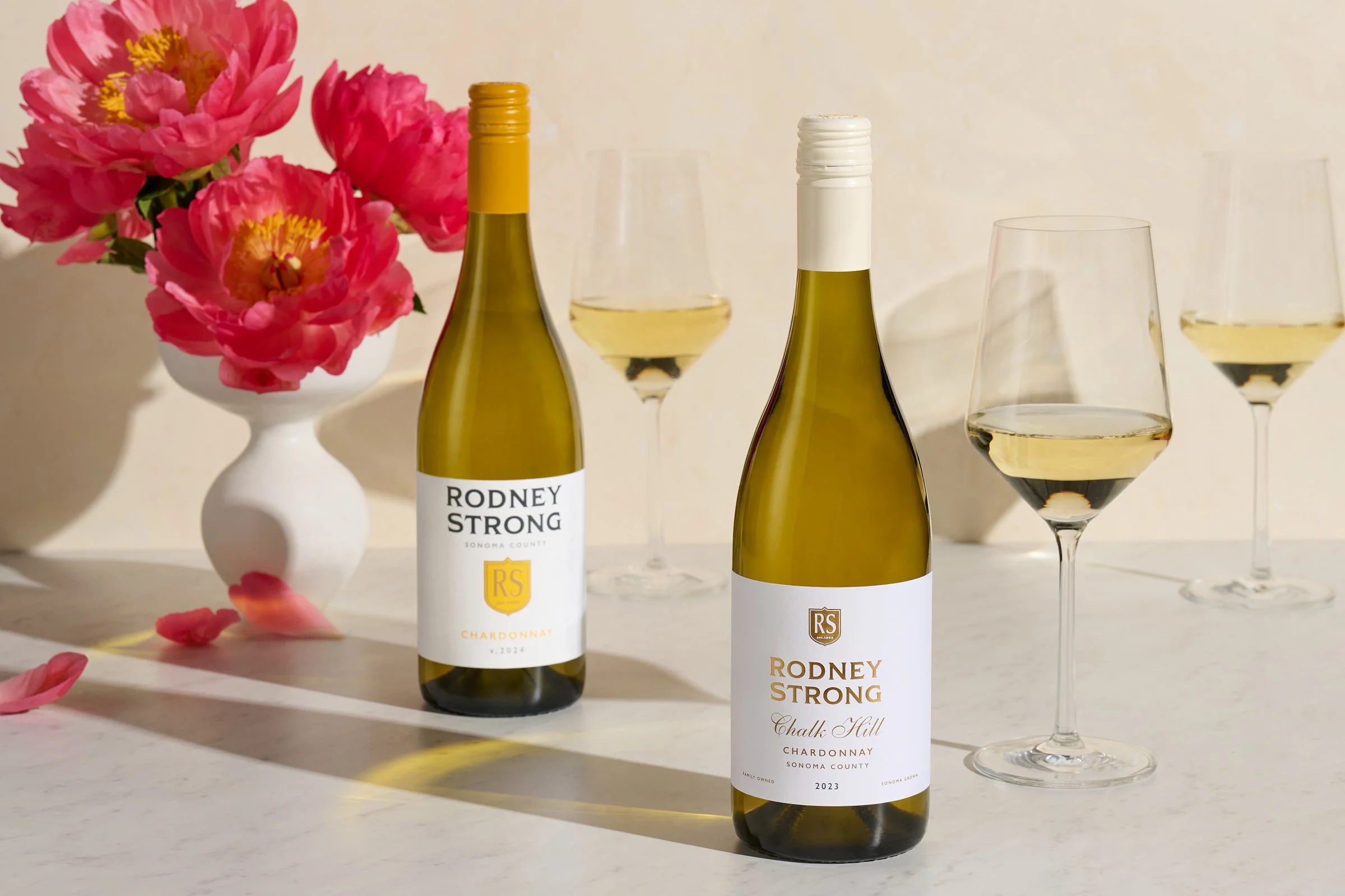
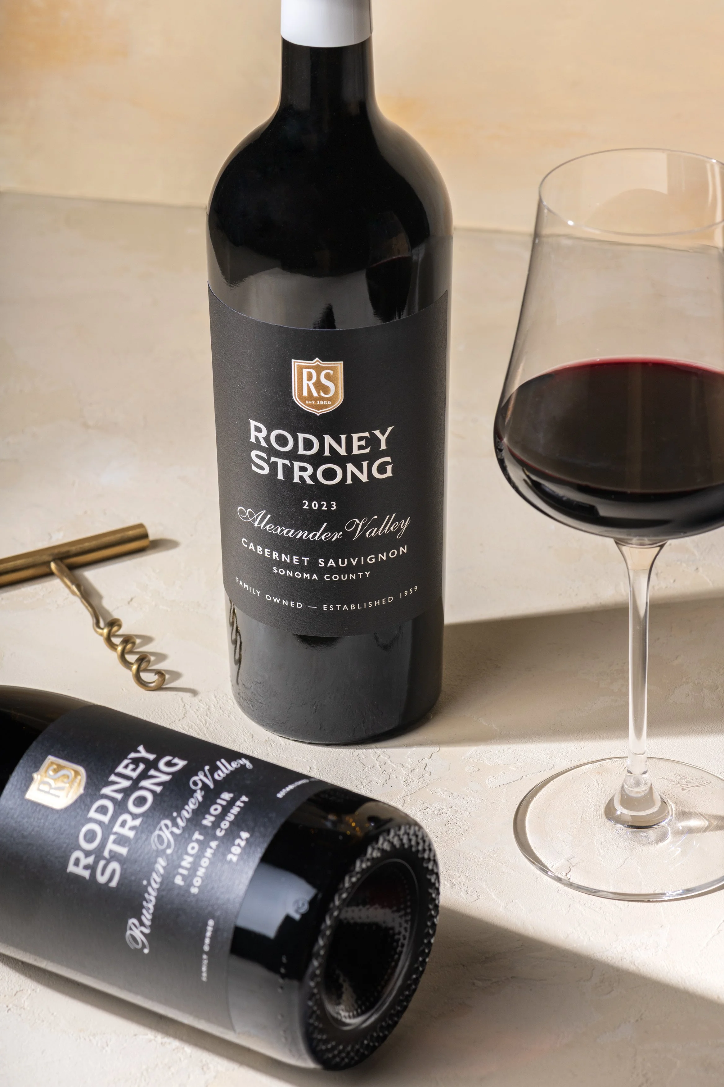
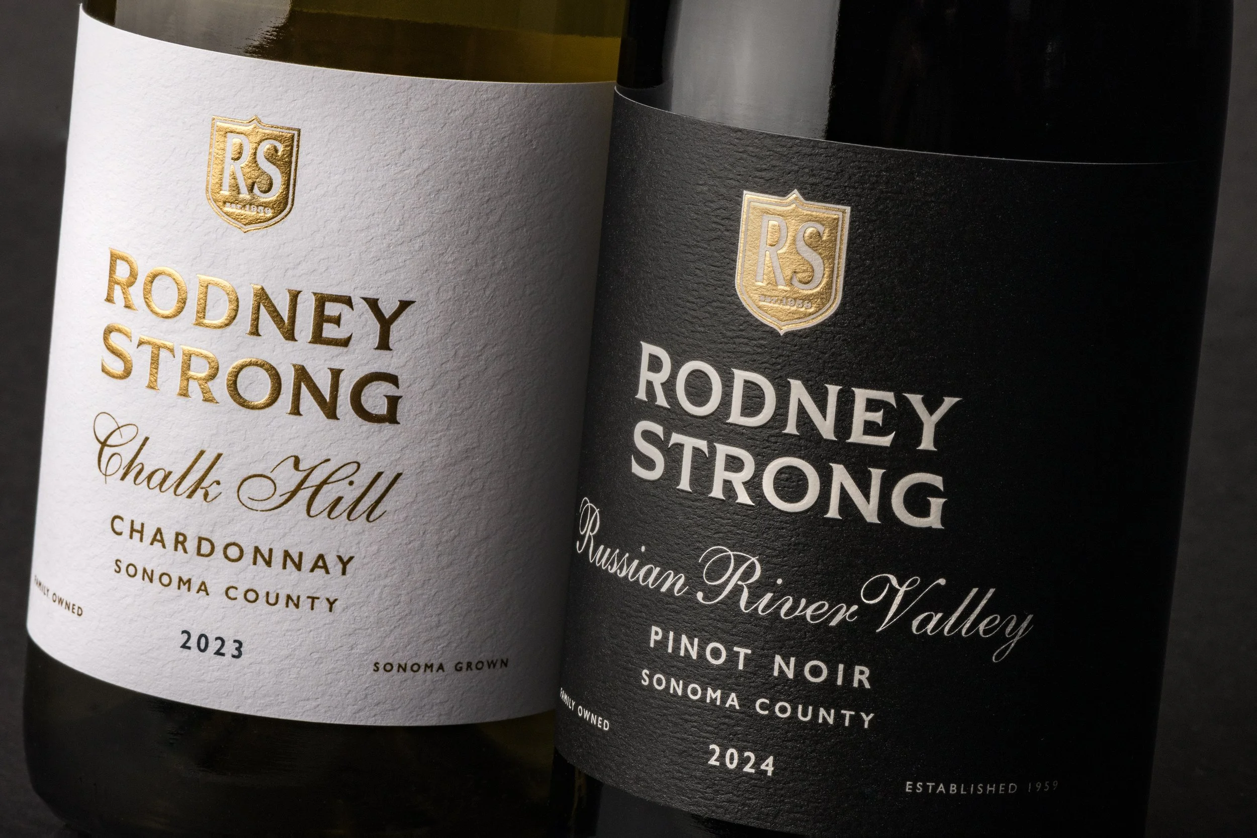
For Rodney Strong’s Estates collection, it’s all about a sense of place. With each wine showcasing a distinct Sonoma County appellation, we brought a renewed sense of sophistication to the familiar packaging. Refined typography, contrast, and thoughtful details lend each wine a little more elegance and personality.
The refreshed packaging creates greater distinction from the Sonoma Core tier, giving the Estates collection room to stand apart without losing the family resemblance.