Pedroncelli
PACKAGE REFRESH
Situated on the dramatic slopes of Dry Creek Valley, Pedroncelli Winery has been producing wines for over 95 years, supported by four generations of family winemaking. To honor this heritage while appealing to modern audiences, a strategic branding and packaging refresh was undertaken to elevate the winery’s identity.


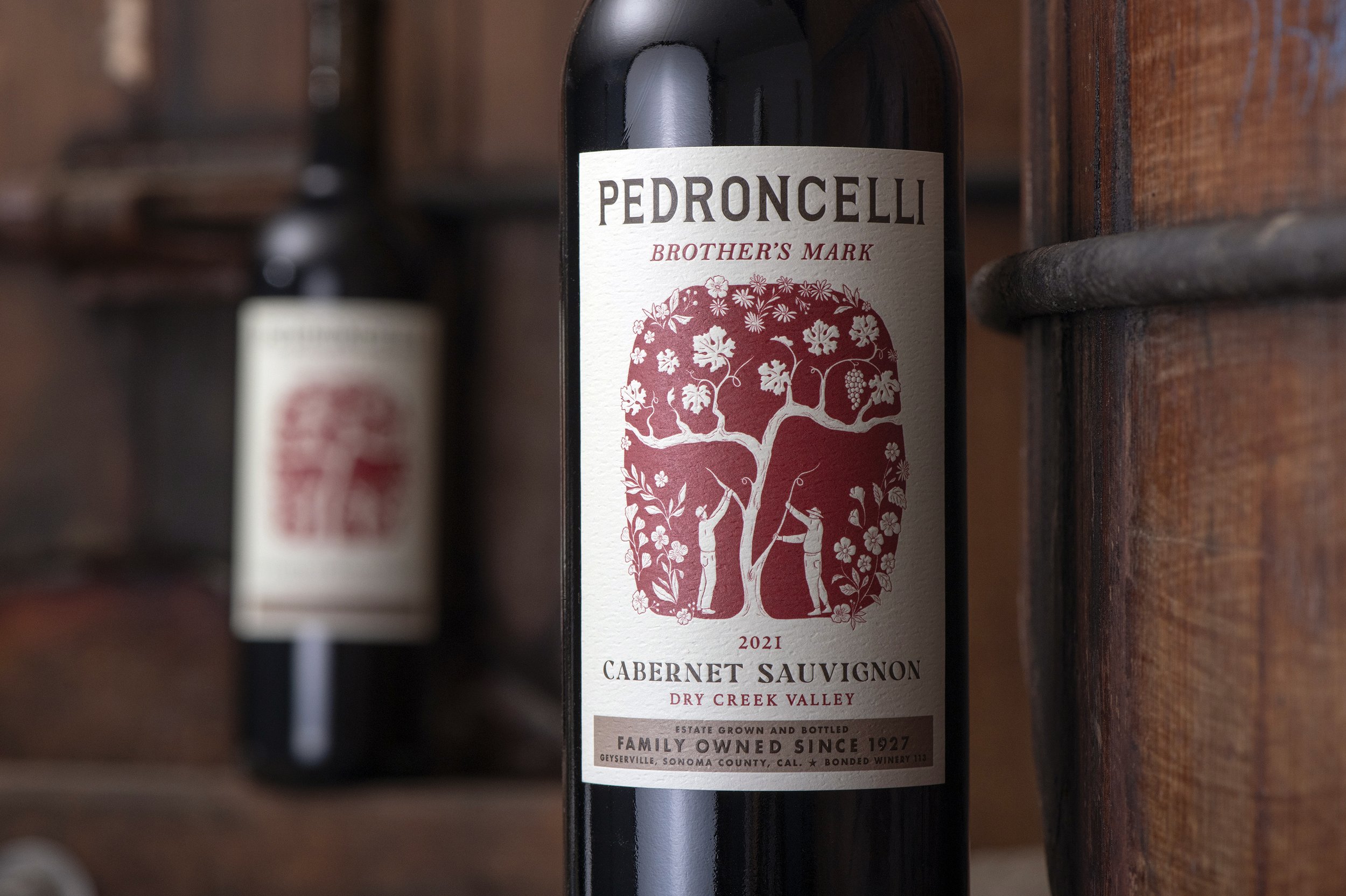
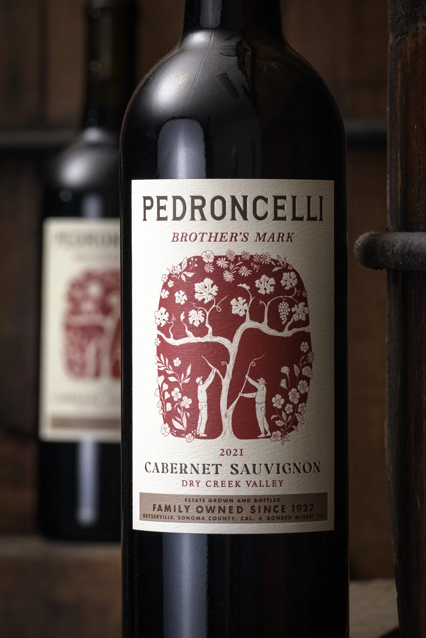
The branding refresh included four custom illustrations created in collaboration with artist Shannon Lujan, celebrating Pedroncelli’s rich history and legacy. Each label tells a unique story: Giovanni & Giulia features an intertwined tree representing the strength and unity of the founders, with Sauvignon Blanc leaves nodding to their craft; Mother Clone depicts a nurturing figure propagating new vines from old Zinfandel roots, symbolizing generational continuity; Brother's Mark showcases two brothers training a vine together, reflecting their enduring partnership and contributions to Sonoma Valley; and Sonoma Classico highlights elements of the historic winery, paying homage to the family’s collaborative spirit and winemaking heritage.

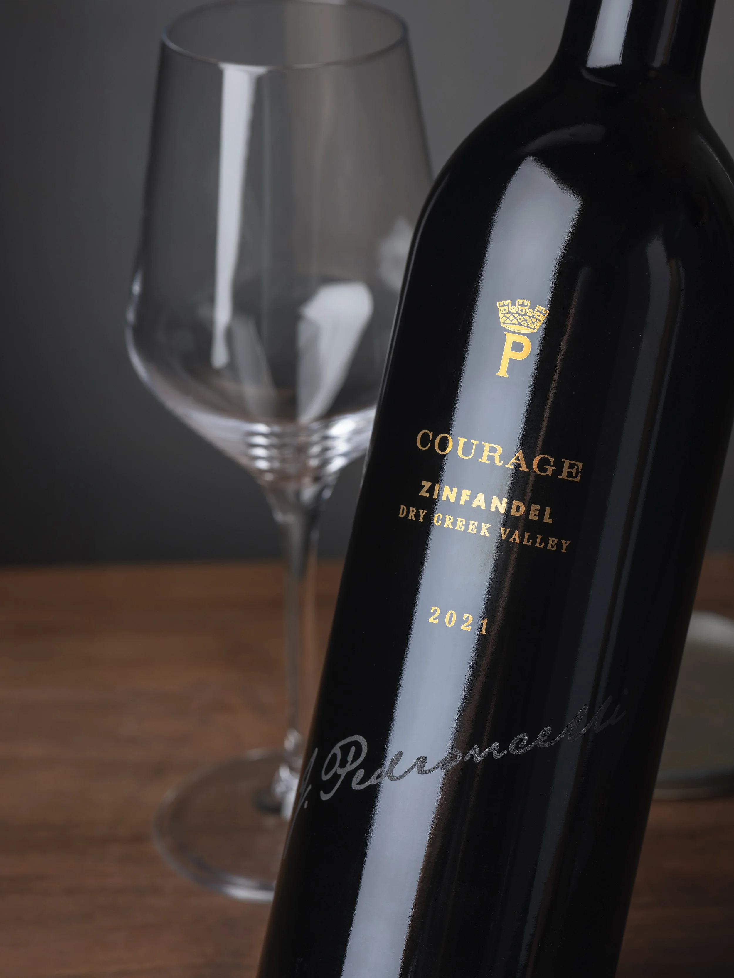
The design system is anchored around a historic brandmark drawn from a barn on the property, dating back to 1927. This icon was refreshed, and a tier-specific hierarchy was established to highlight vineyard names, blocks, fanciful names, and the winery’s designation as Bonded Winery 113.


The updated branding elements were extended to Pedroncelli’s signature offerings. The Single Vineyard tier preserved legacy design elements while incorporating contemporary white space, and the Select tier adapted these elements for screen printing, establishing a distinctive and cohesive visual identity.


Photography: George E. Baker Jr.

