Mount Veeder
PACKAGE DESIGN, ILLUSTRATION
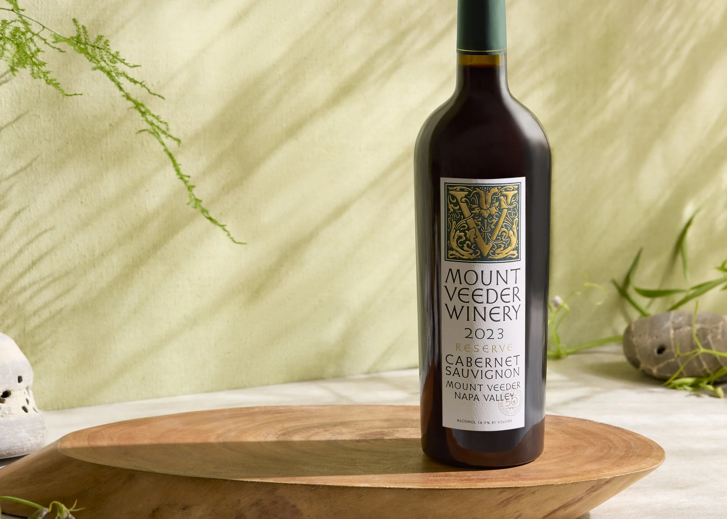
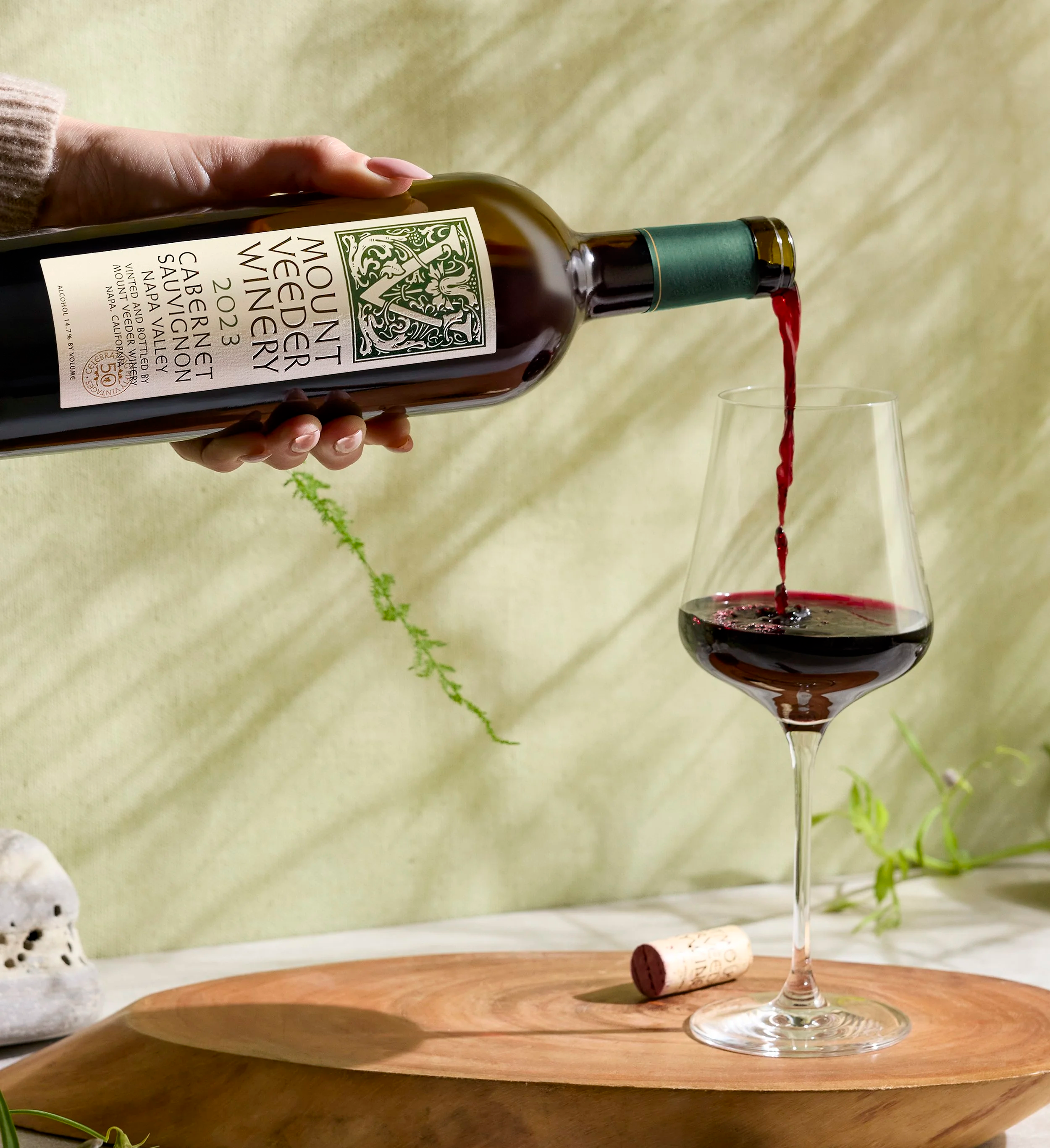
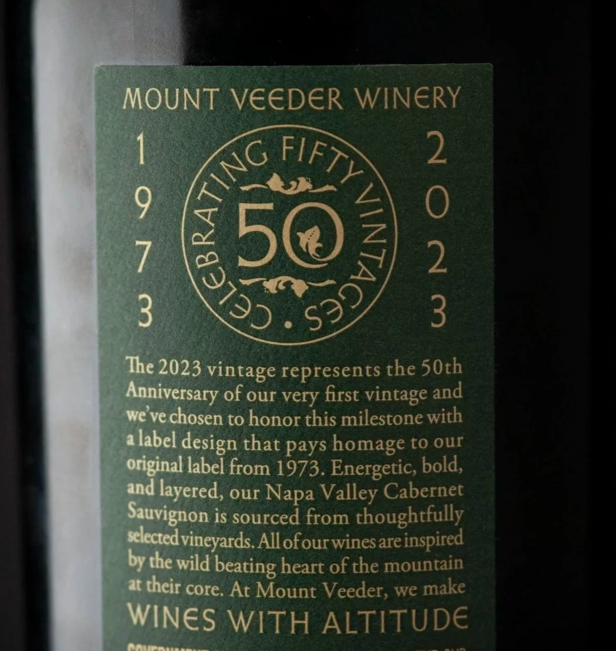
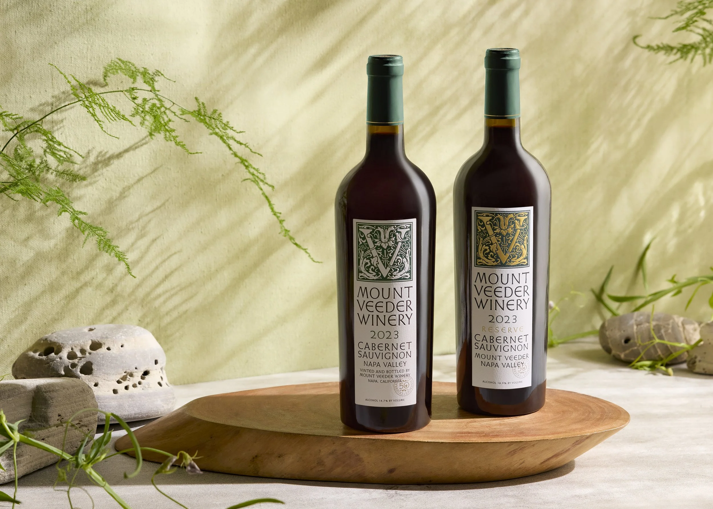
For Mount Veeder Winery’s 50th anniversary, we partnered with the Mount Veeder team to revisit their historic packaging, drawing from the original 1973 label. From the icon and typography to brand colors and paper choices, every detail was handled with intention and respect.
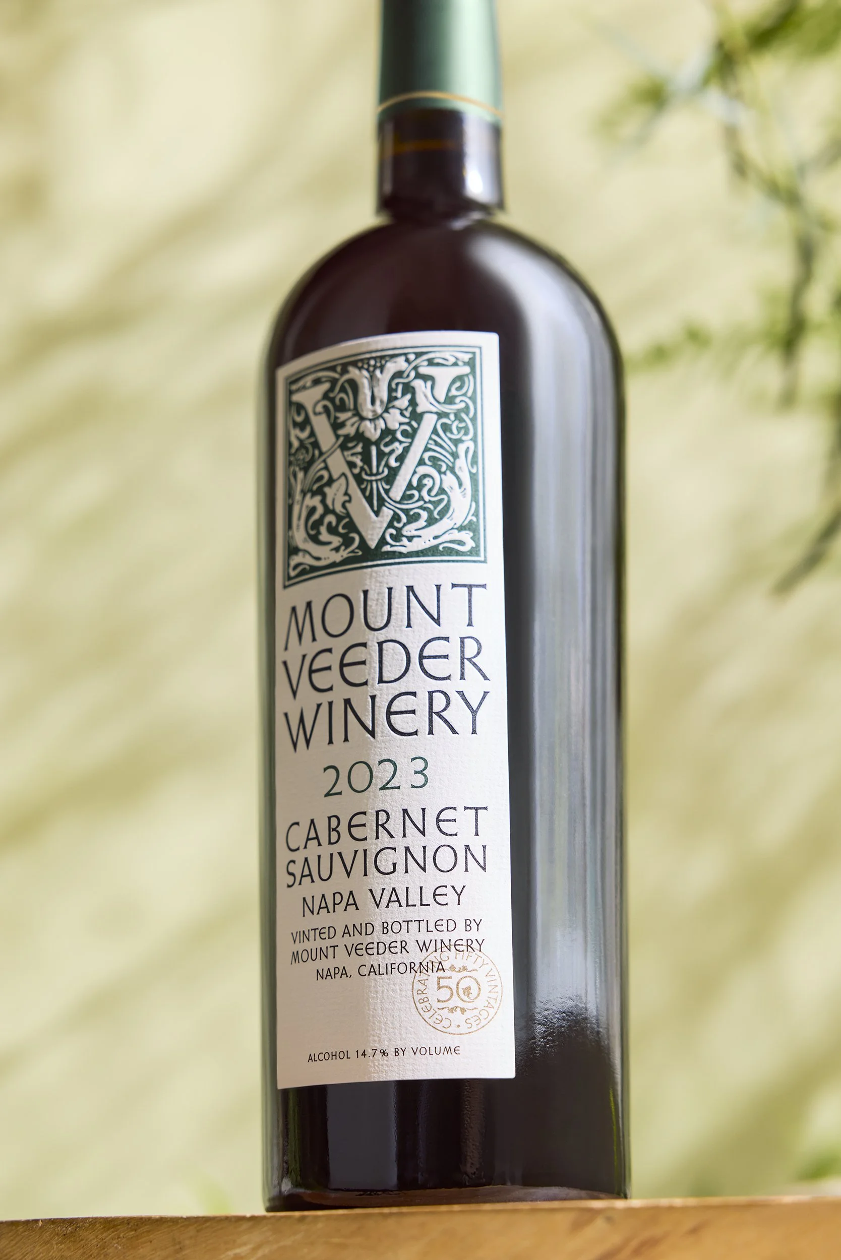
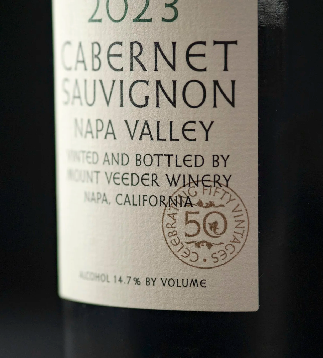
In refreshing Mount Veeder Winery’s identity, each letter was reviewed and redrawn, refining proportions, spacing, and weight to improve clarity and impact across the system. Subtle adjustments brought greater balance and legibility, allowing the wordmark to stand alongside the elevated seal—on package and beyond. A quiet but essential part of the refresh, reinforcing the identity at every scale.
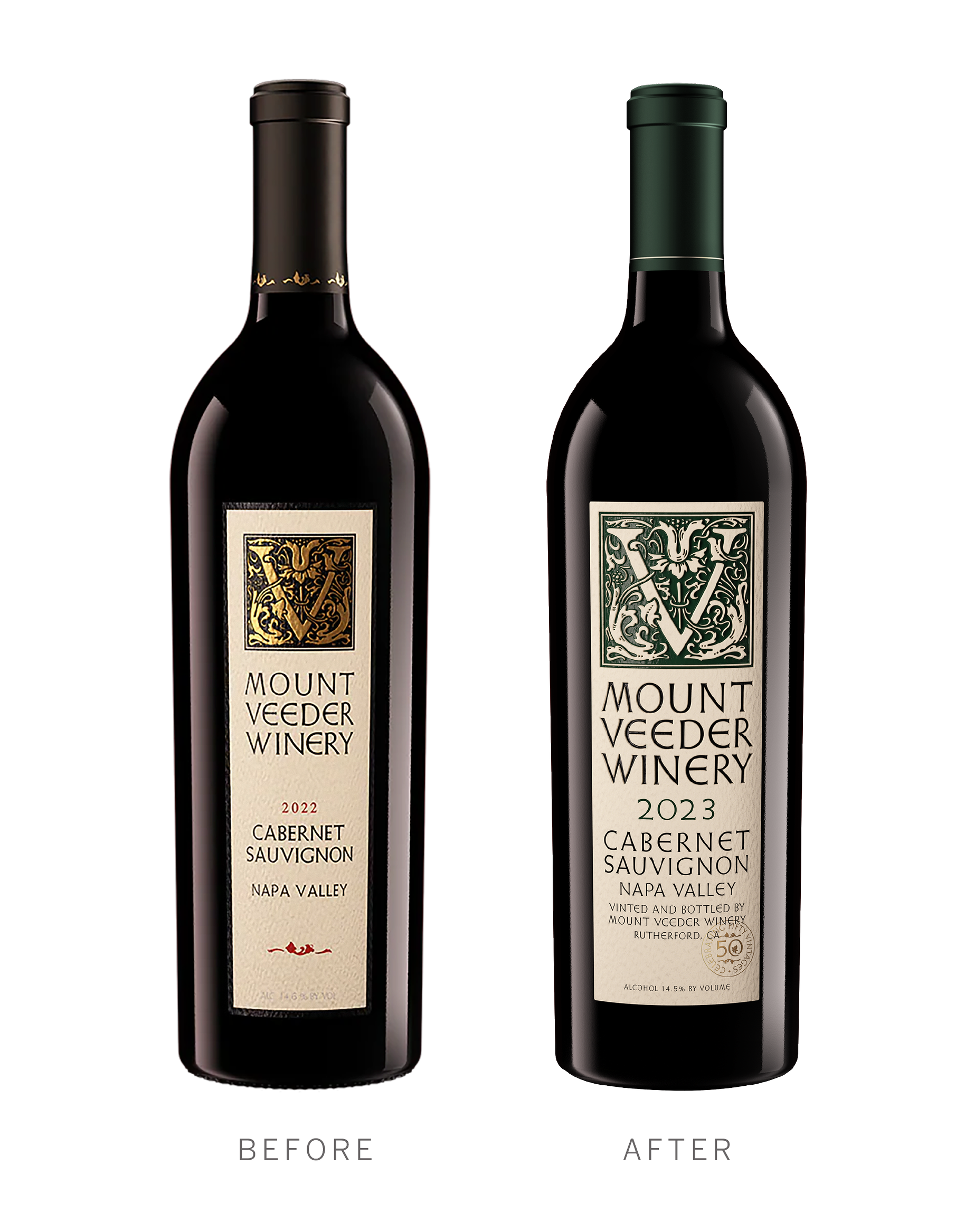
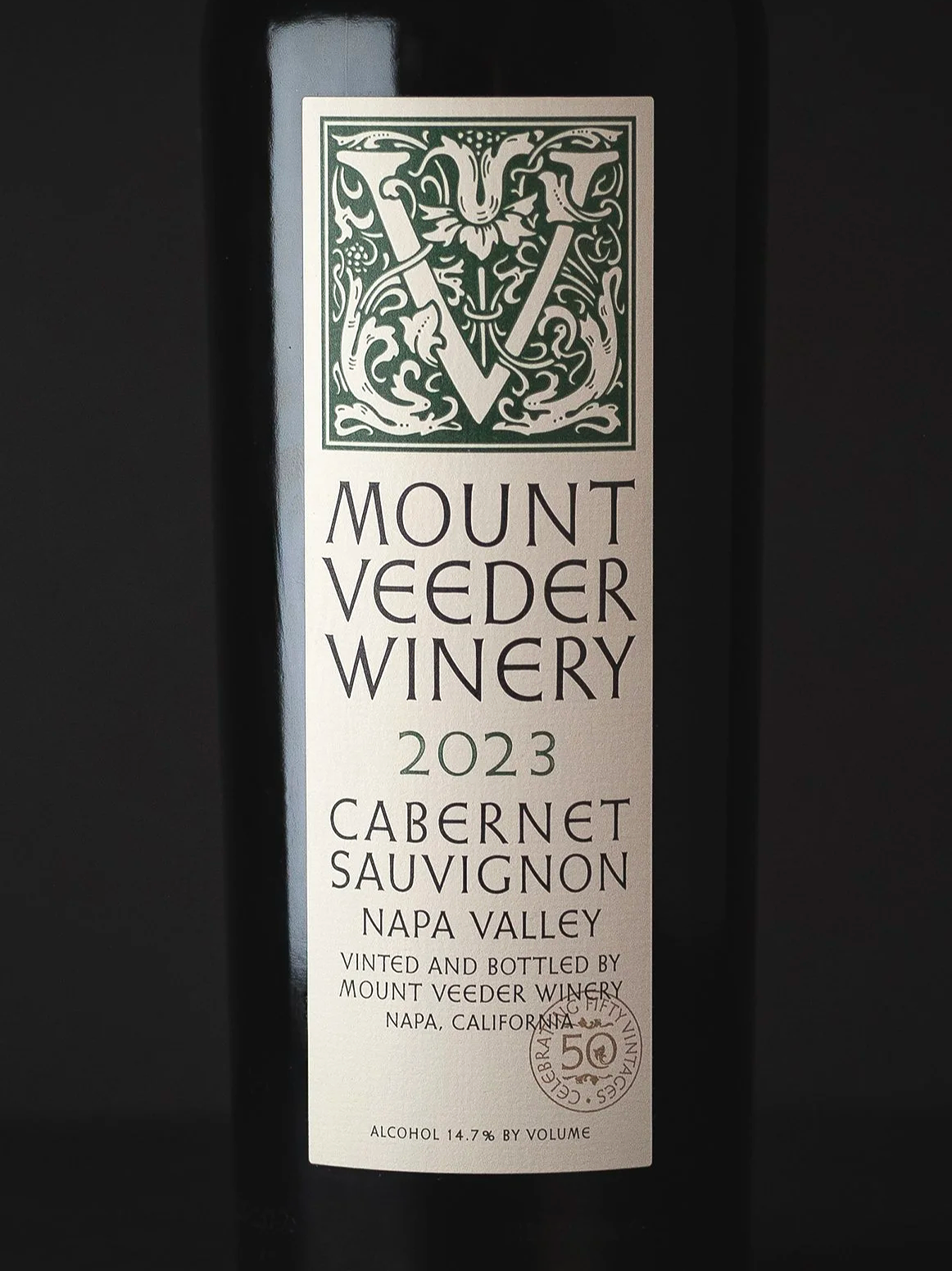
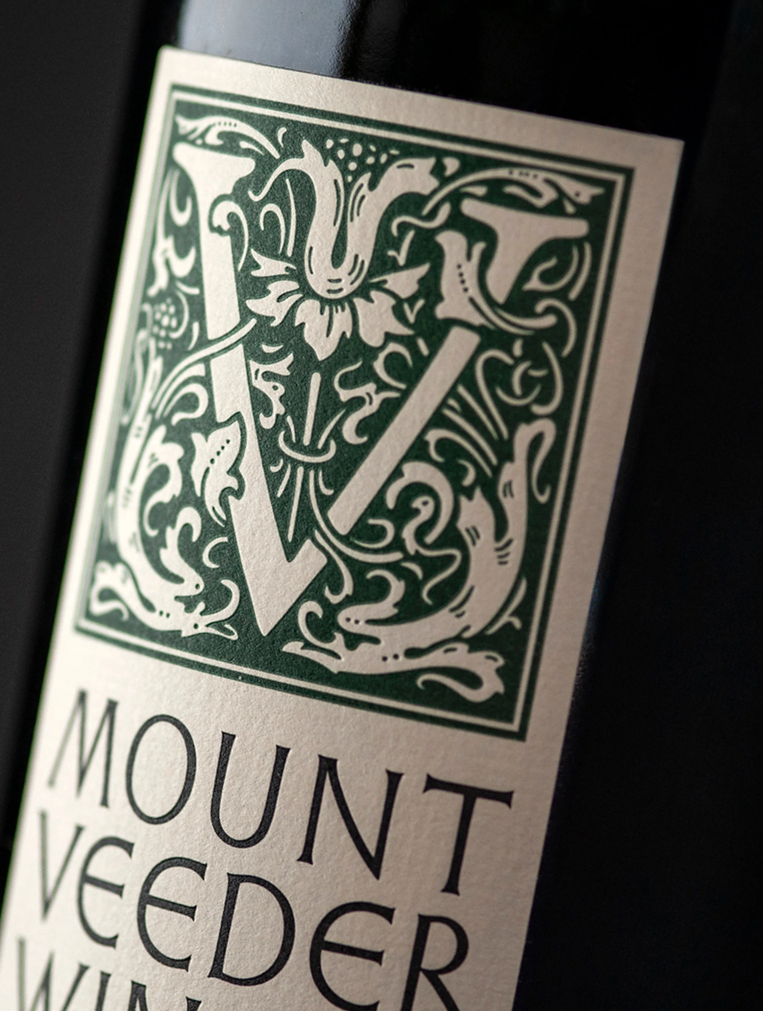
The iconic “V” was restored and redrawn by hand, bringing back subtle details lost over time. A deliberate approach to preserving the brand’s character and honoring its origins while strengthening its presence today.