Tidings
BRANDING, PACKAGE DESIGN
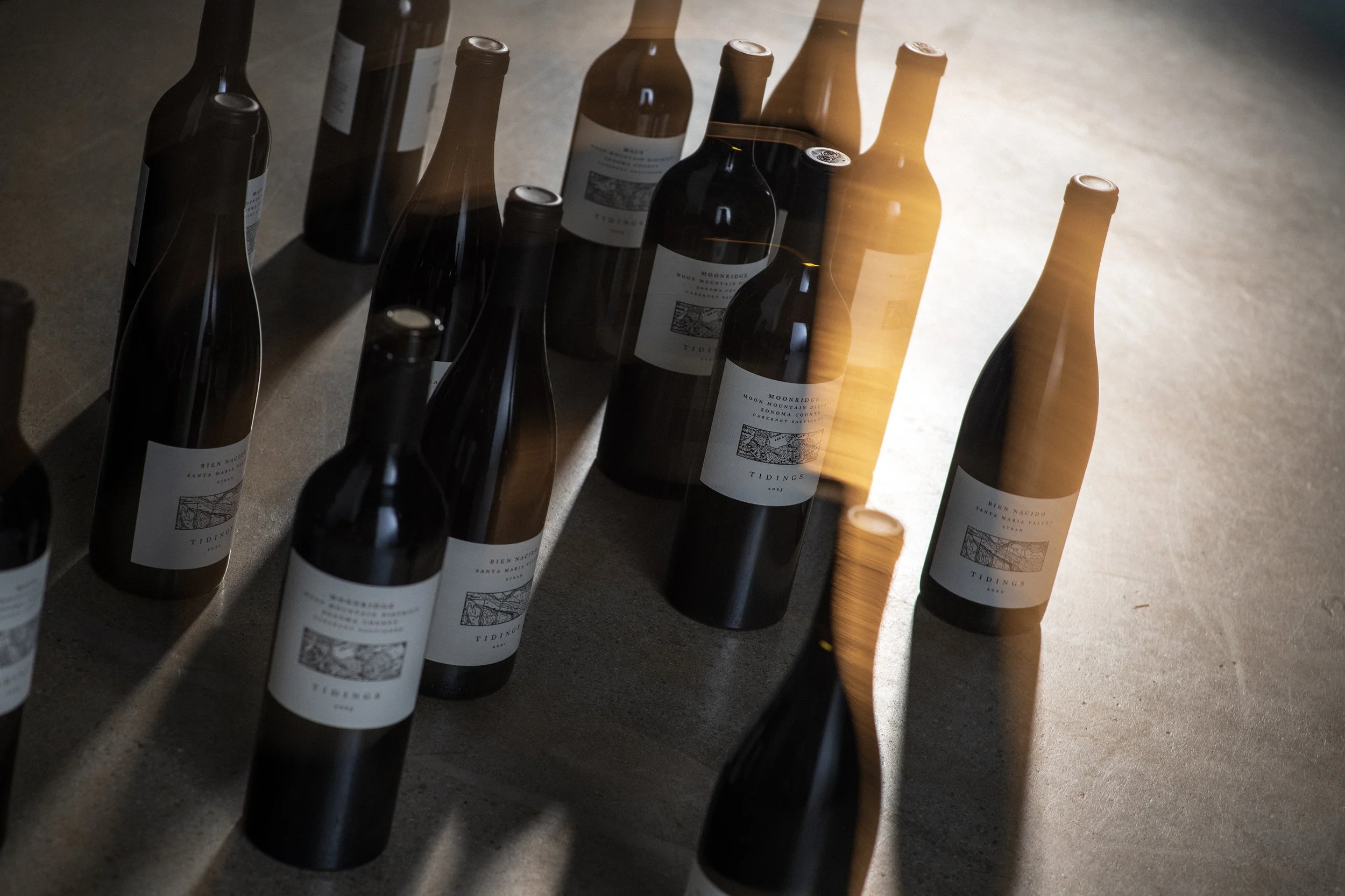
Tidings is founded on the belief that great wine is a reflection of place. Winemaker Reid Griggs approaches each bottling with traditional techniques, native fermentations, and minimal intervention, allowing the vineyard—not the winemaker—to define the final expression. Every vintage becomes a message carried from the land itself: tidings of season, site, and time.

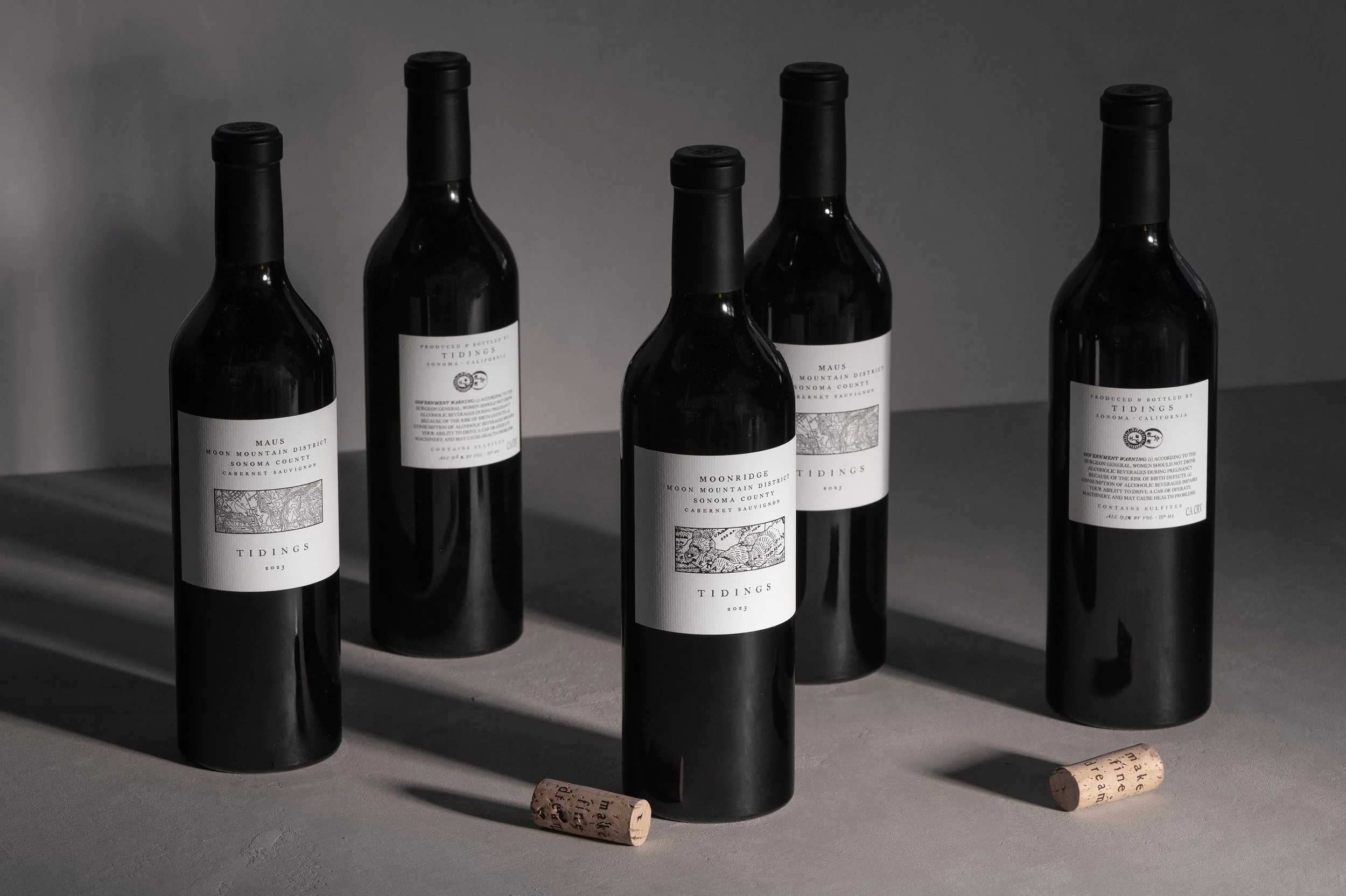
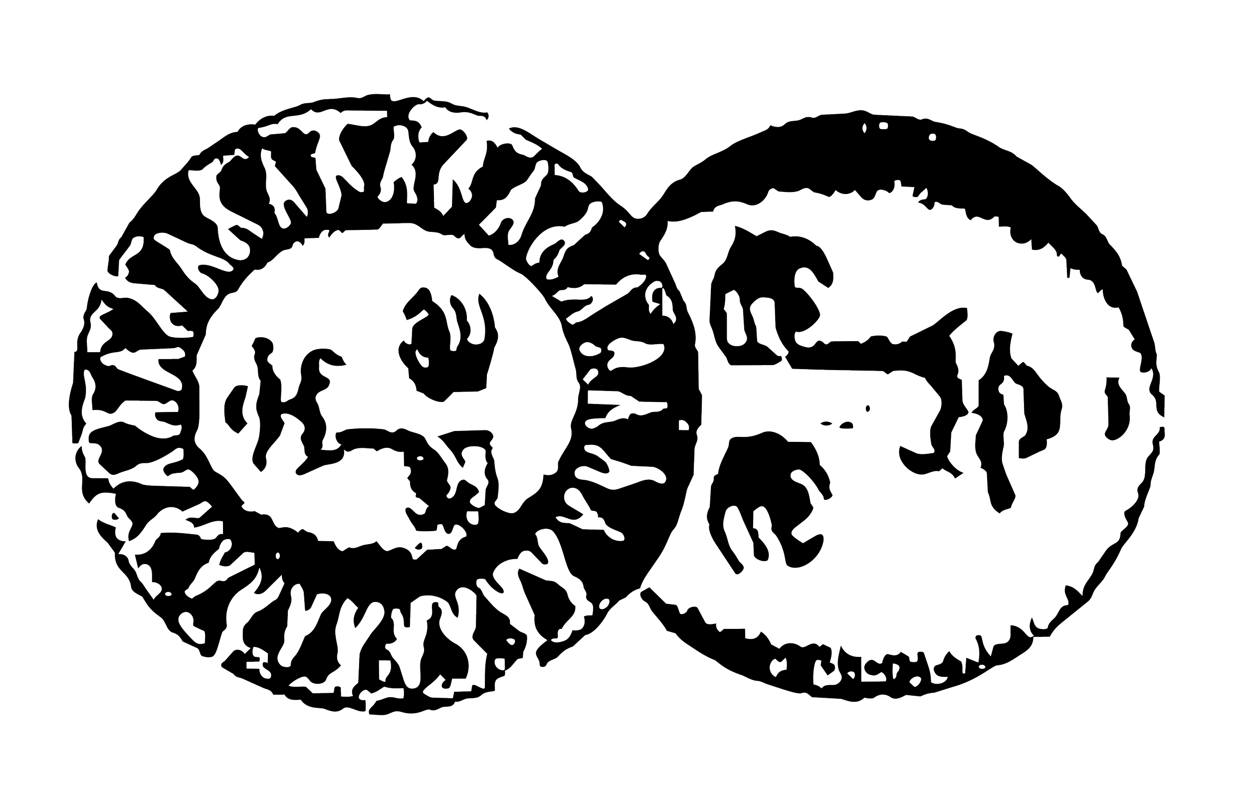
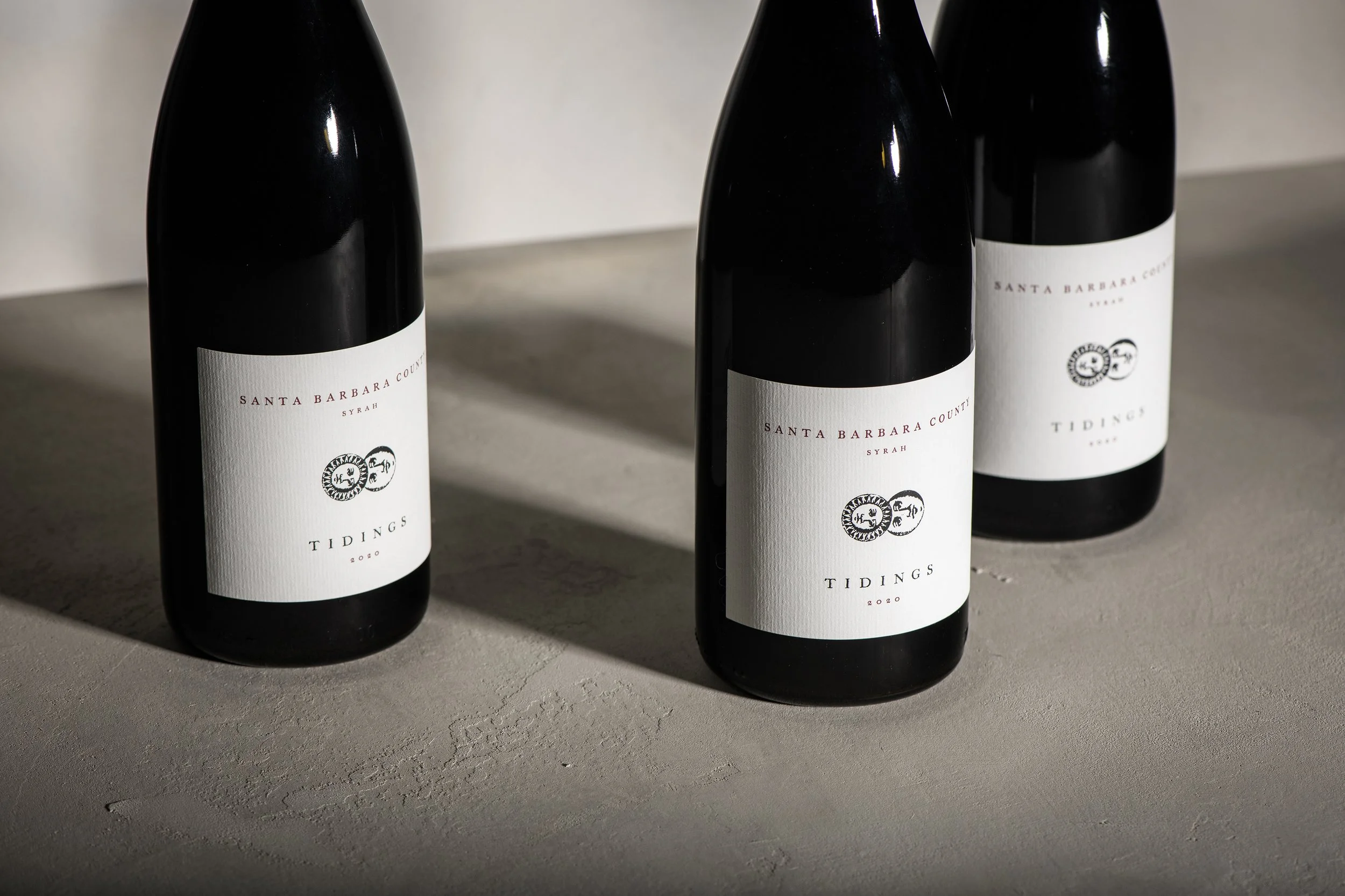
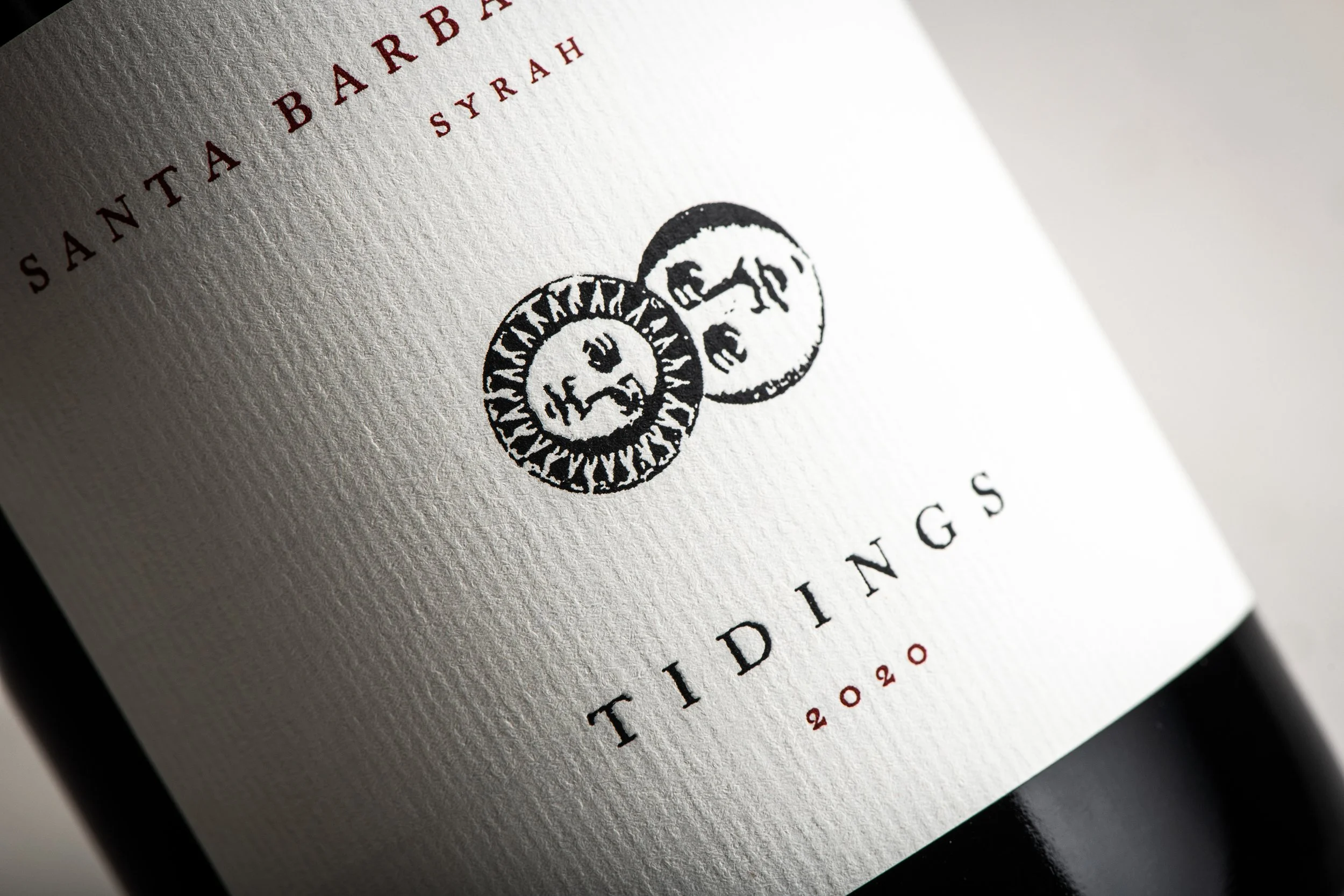
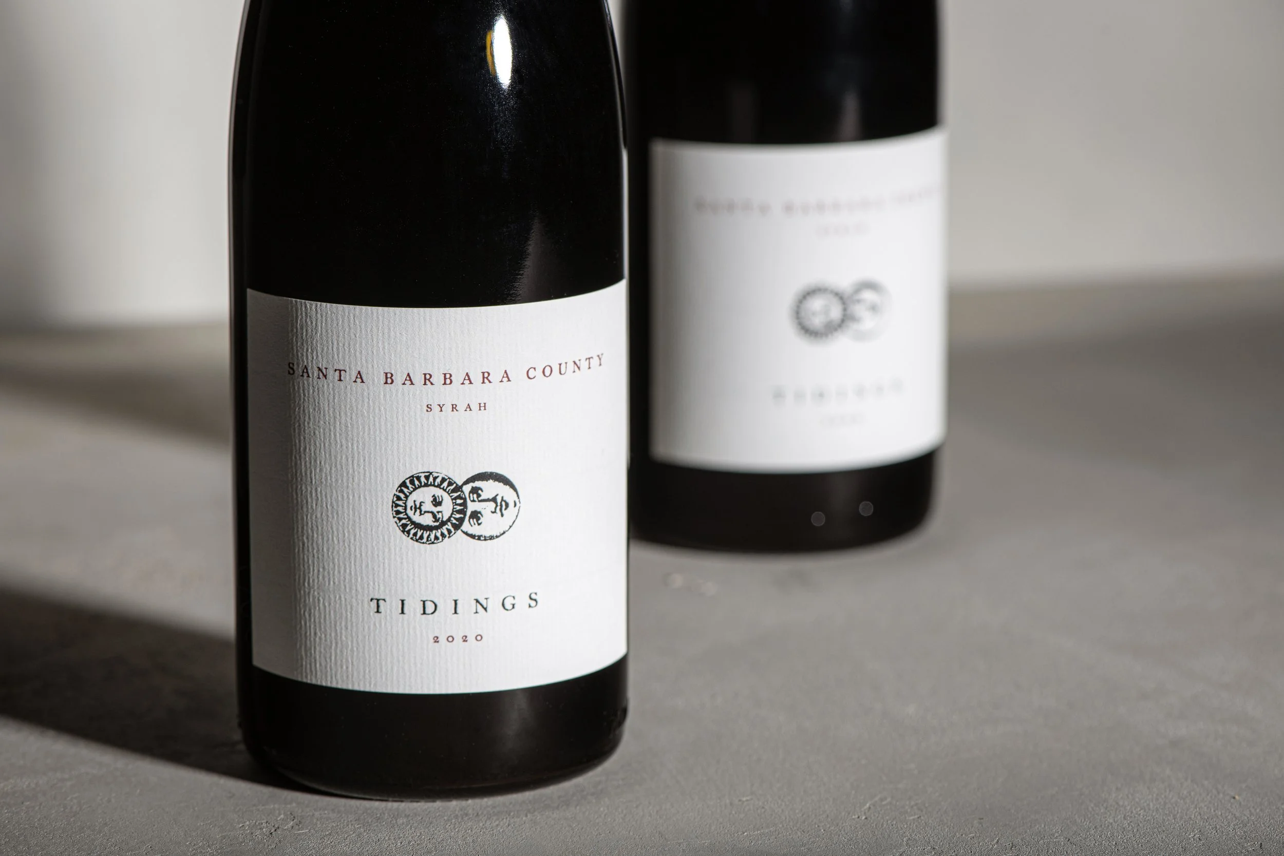
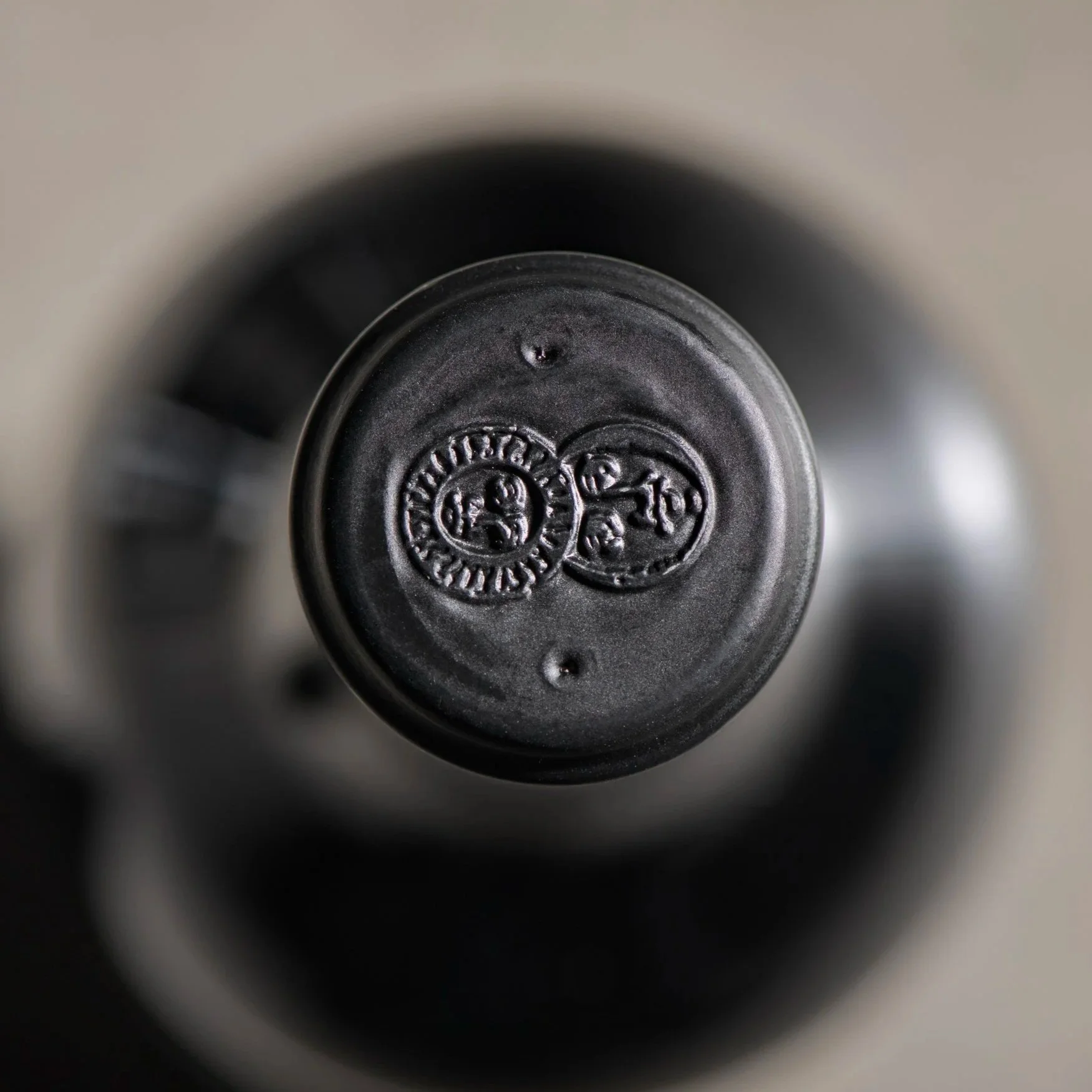
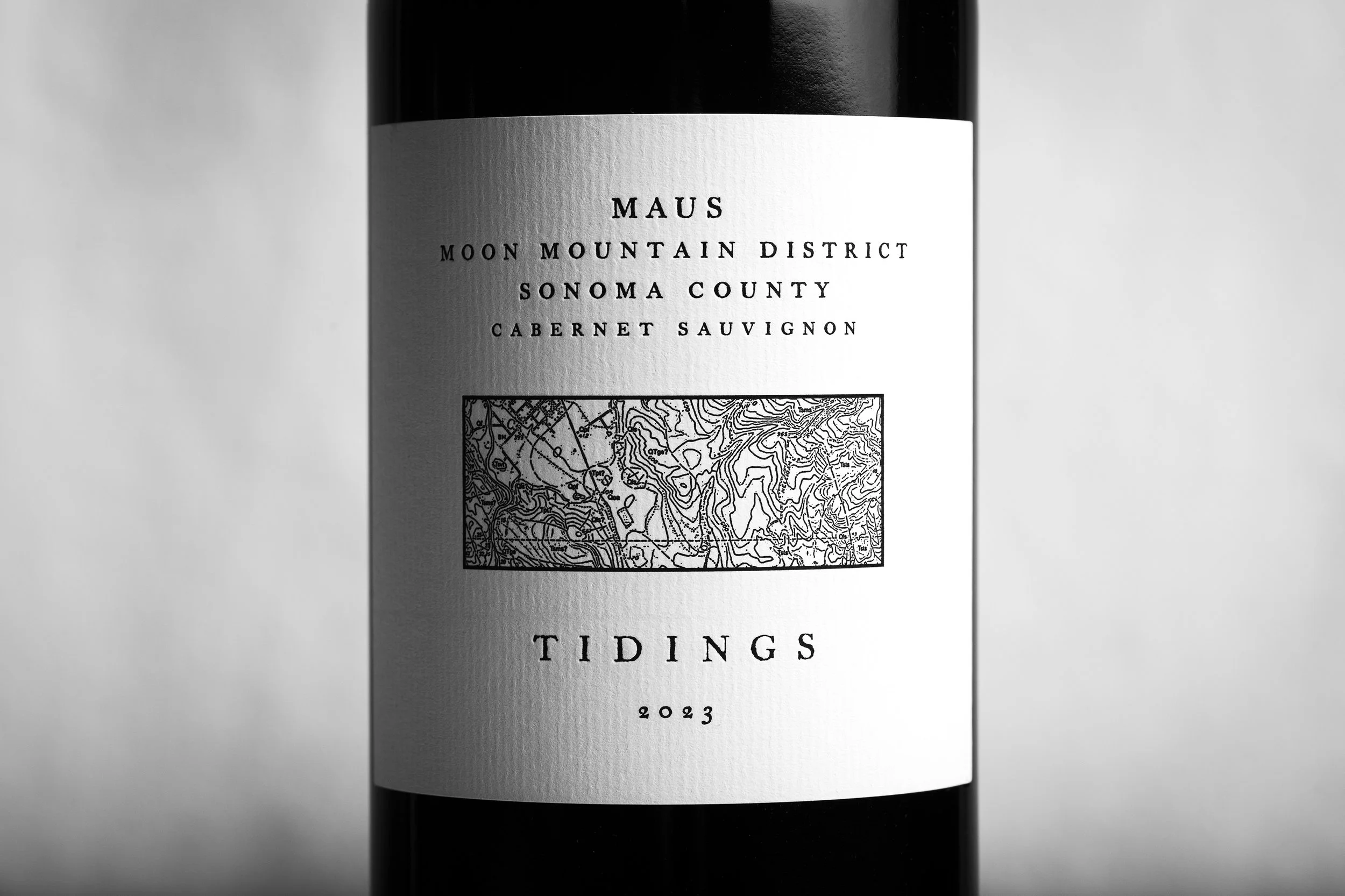
That philosophy became the foundation for the packaging system. Rather than illustrating vineyards literally, we looked to historic maps of the regions where the wines originate, cropping fragments of topography into quiet graphic compositions unique to each bottling. Paired with restrained typography and subtle celestial symbolism inspired by the natural rhythms of the growing season, the identity captures the timeless, site-driven character of the wines while allowing every vineyard and vintage to tell its own story.