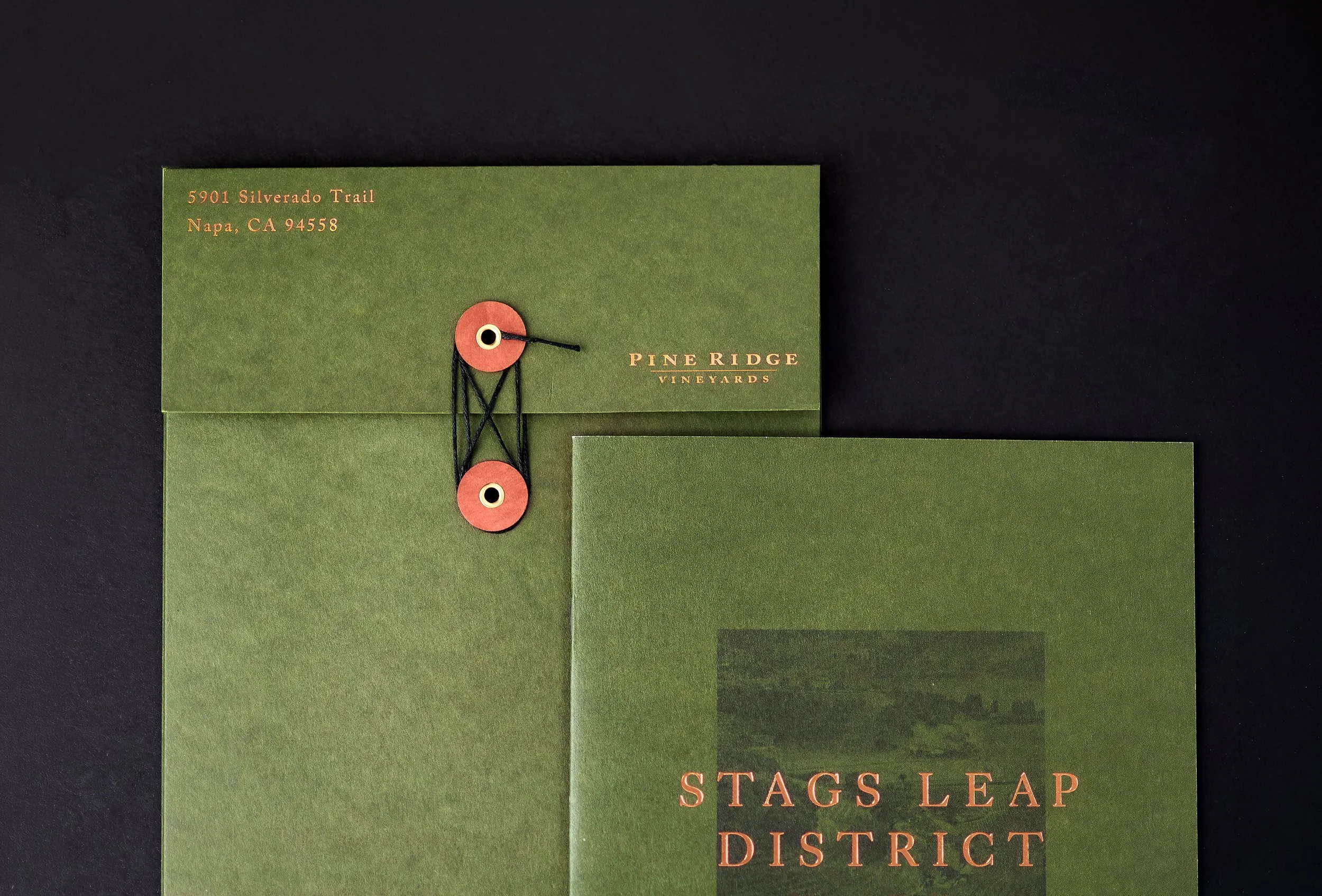
Drawing inspiration from the winery and its Stags Leap District home, we developed an elevated collateral system designed to strengthen the guest experience while remaining flexible and functional for day-to-day hospitality use. The work included refined tasting menus, brochures, and a custom folio, along with a refreshed Stags Leap District AVA map that brings greater context to Pine Ridge’s sense of place and invites guests to further explore the wines and their origins.
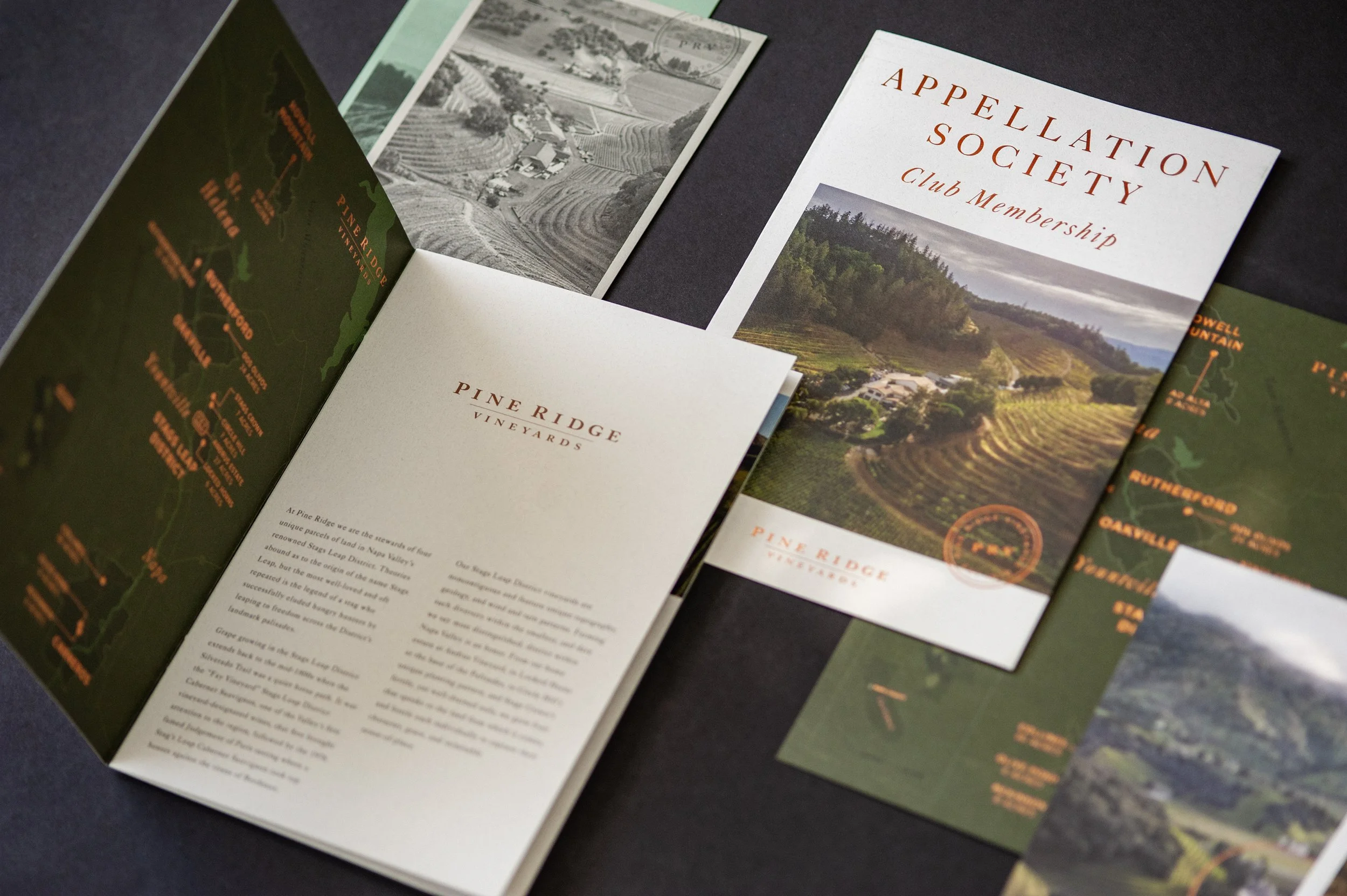
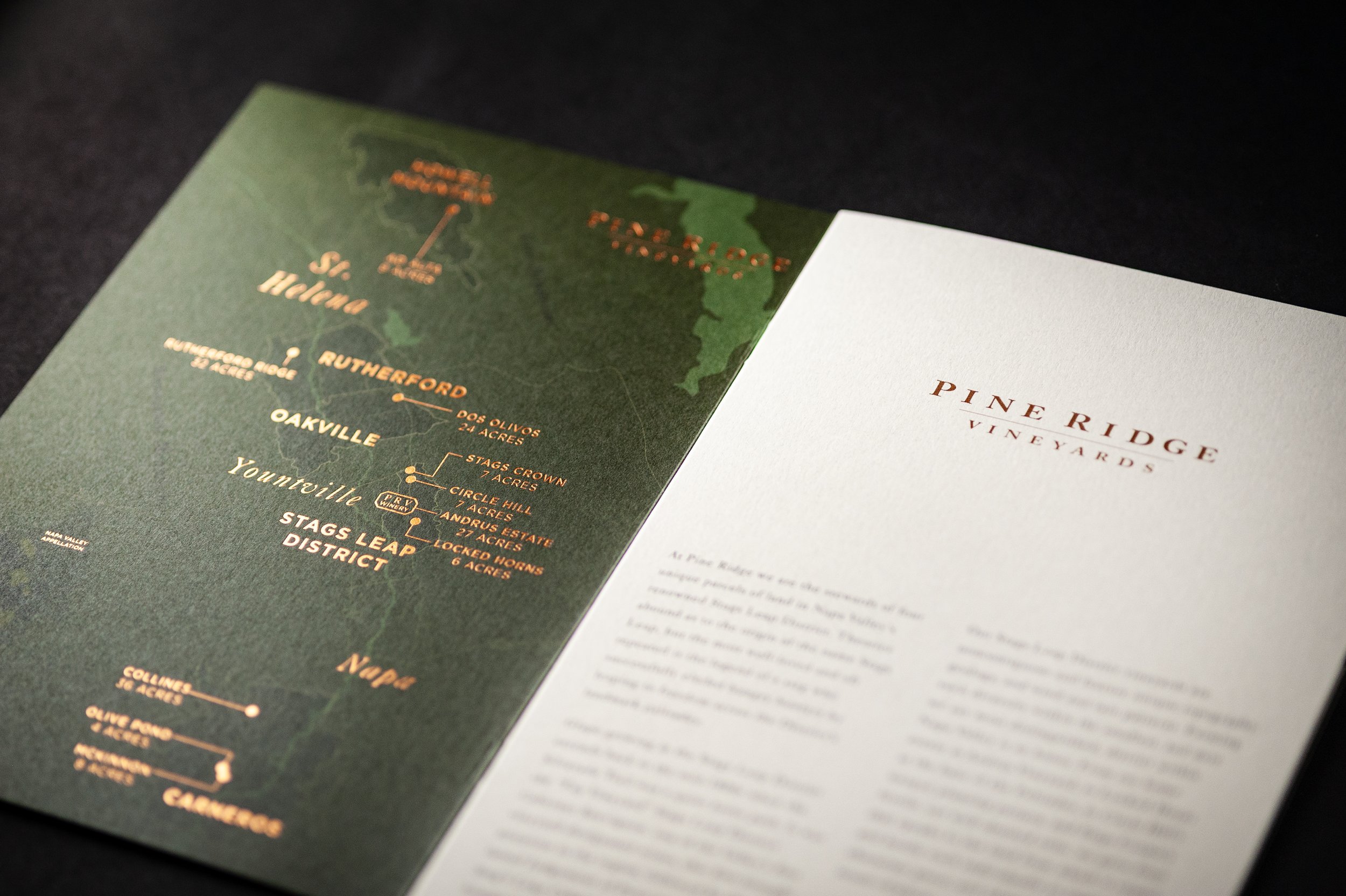
Across the system, thoughtful materials, production details, and a consistent visual language create a more considered tablescape while allowing individual pieces to work seamlessly across tastings, events, and other winery experiences. The result extends Pine Ridge’s Explorer identity beyond the bottle, creating a tactile expression of the brand that feels premium, welcoming, and distinctly connected to the estate.
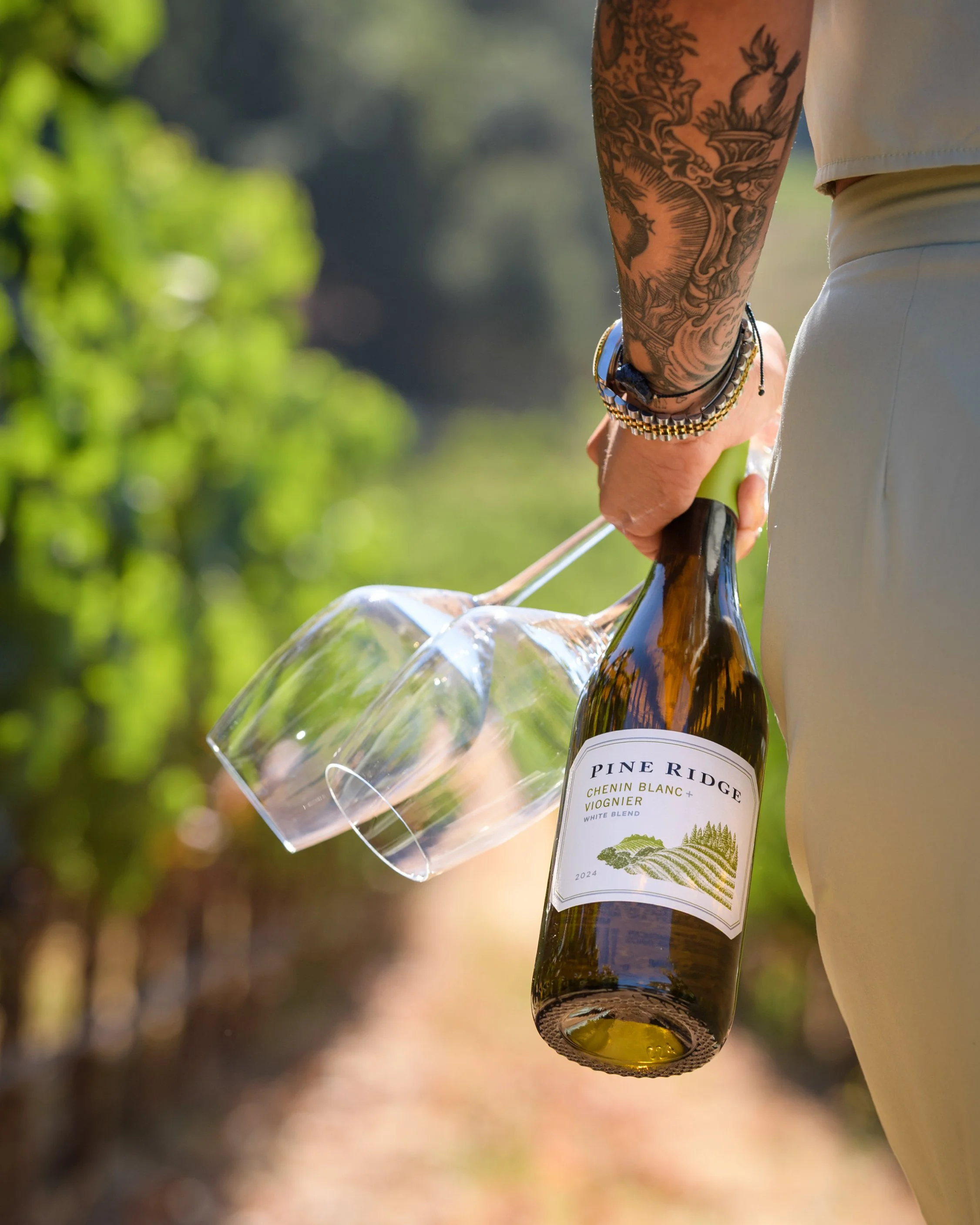
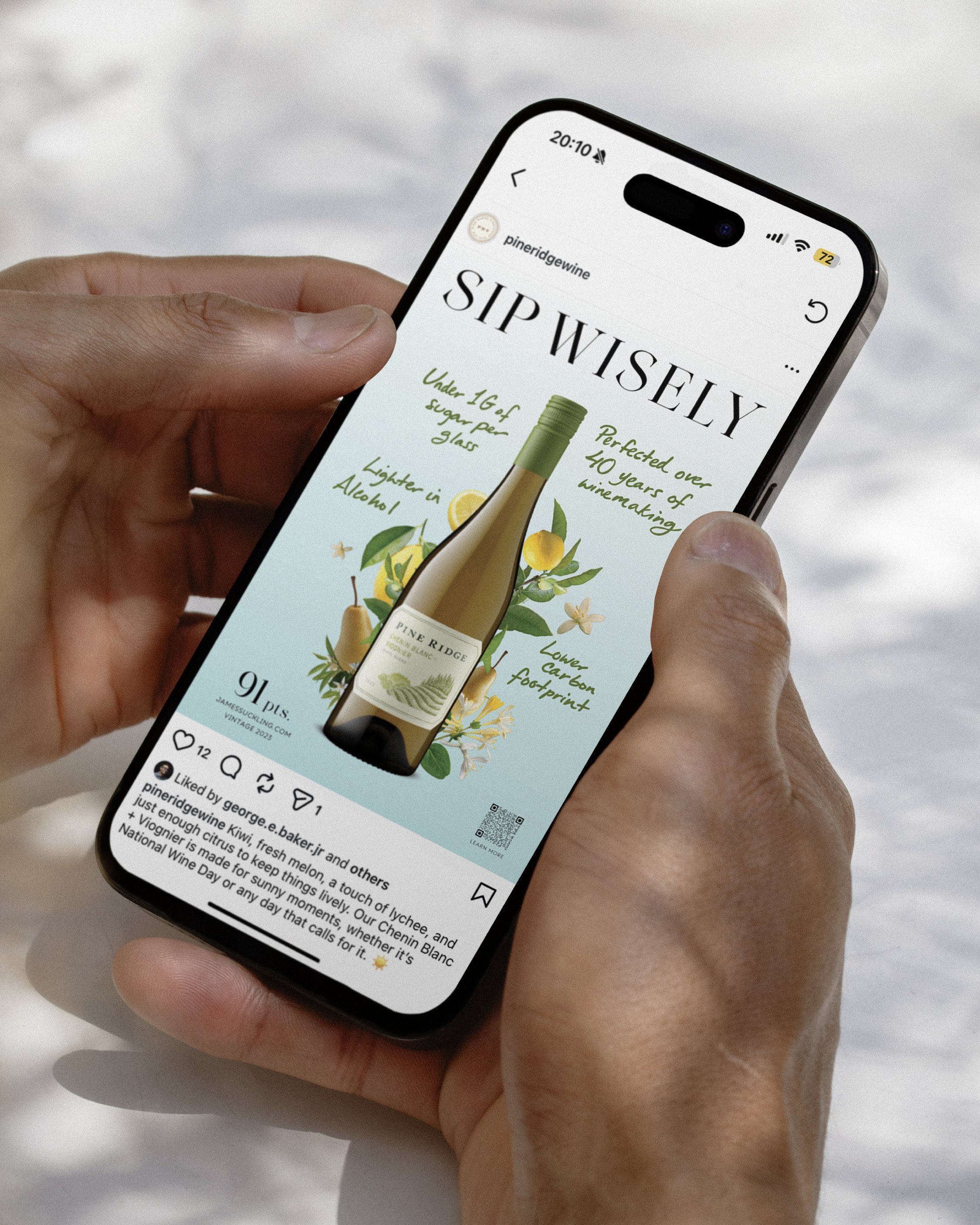
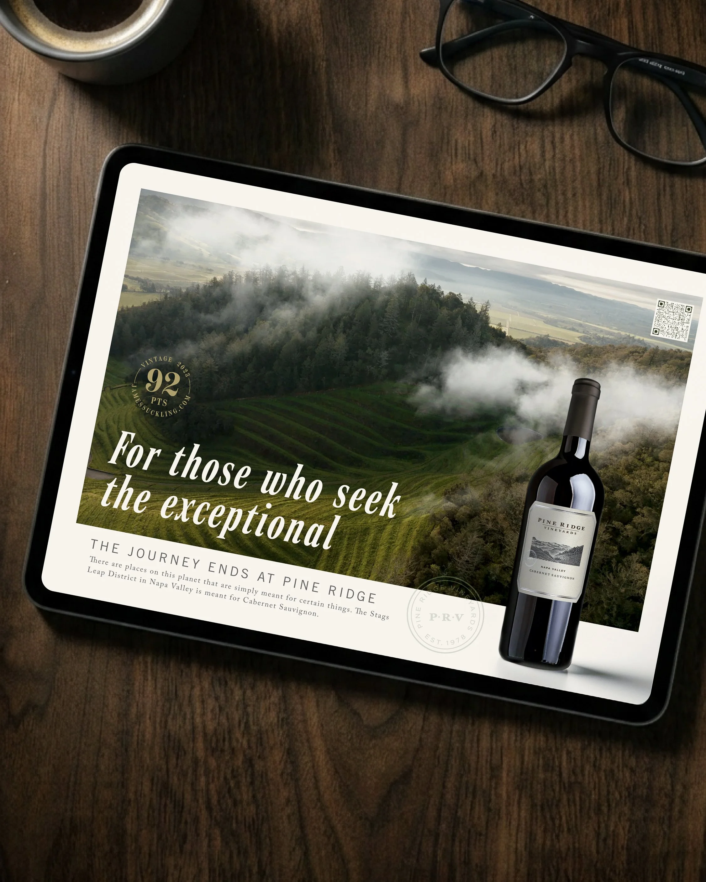
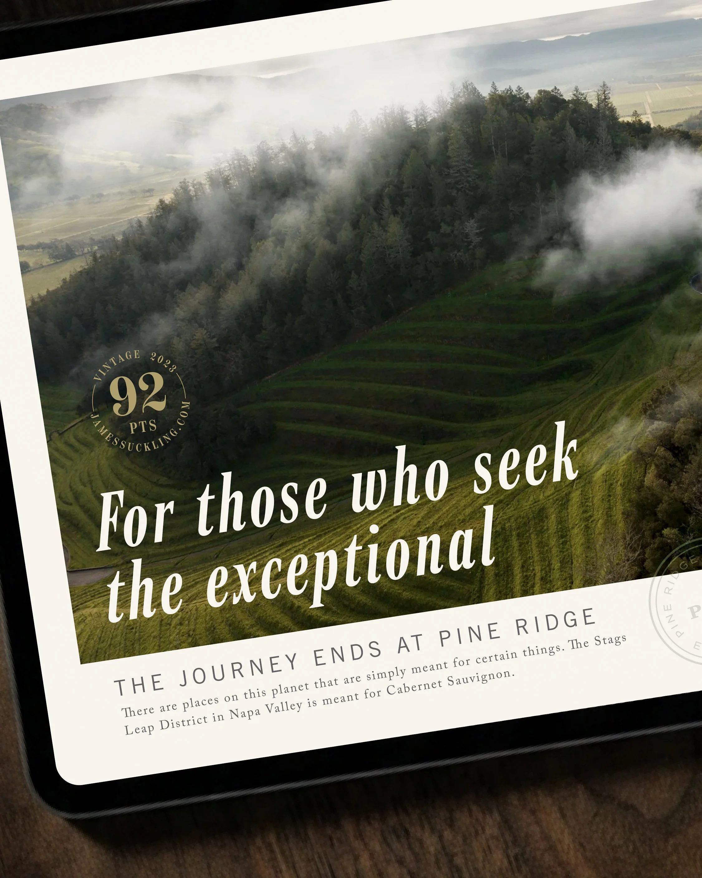
Next, we created updated key visual system across two distinct areas of its portfolio, creating a more cohesive and flexible expression of the brand’s Explorer positioning. For Chenin Blanc + Viognier, we developed a lighter, brighter, and more vibrant visual language centered first on taste and refreshment. Fresh key visuals and messaging emphasized the wine’s crisp, vibrant, and vivacious character while naturally integrating longstanding wellness and sustainability attributes, including lower alcohol, fewer calories, vegan-friendly production, and lightweight glass. The resulting system balances these functional benefits with an inviting, taste-forward expression designed to feel modern, social, and approachable.
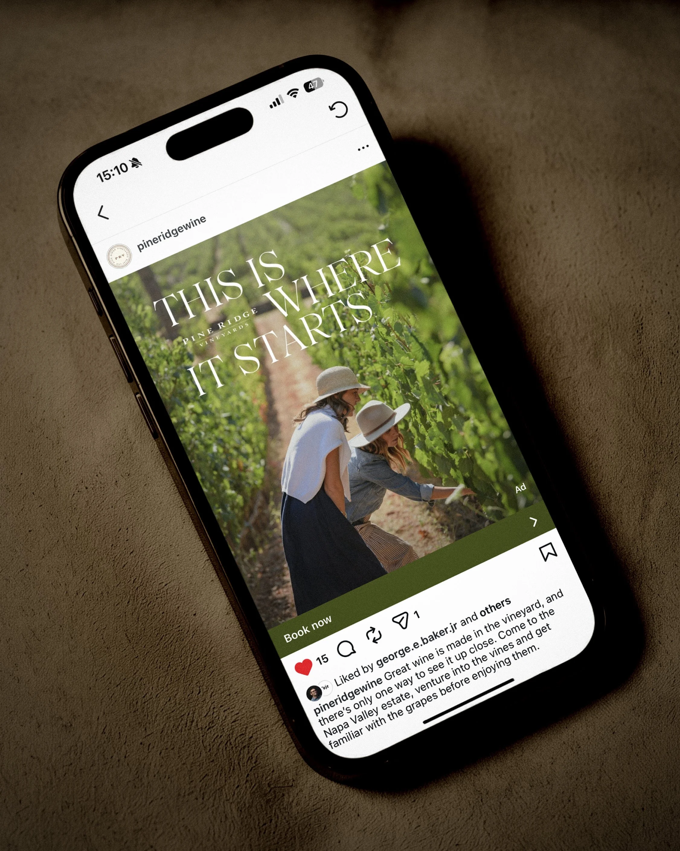
As Gatto Rivera worked with Pine Ridge Vineyards to refresh its hospitality collateral and broader visual storytelling, we identified an opportunity to expand the brand’s photography with imagery more closely connected to the experience of visiting the estate.
Working on location at Pine Ridge, we developed and art directed a focused photography shoot capturing key areas of the property, including the winery’s distinctive caves and outdoor hospitality spaces. The imagery was conceived to communicate the atmosphere, character, and natural beauty of the estate while reinforcing the brand’s connection to exploration, discovery, and its Stags Leap District home.