
Inspired by old-school skate graphics, underground flyers and DIY zines, we took a hands-on approach to the packaging. Loose, hand-drawn illustrations, rough-around-the-edges typography, and plenty of character give each sauce its own identity while keeping the whole family just the right amount of chaotic.
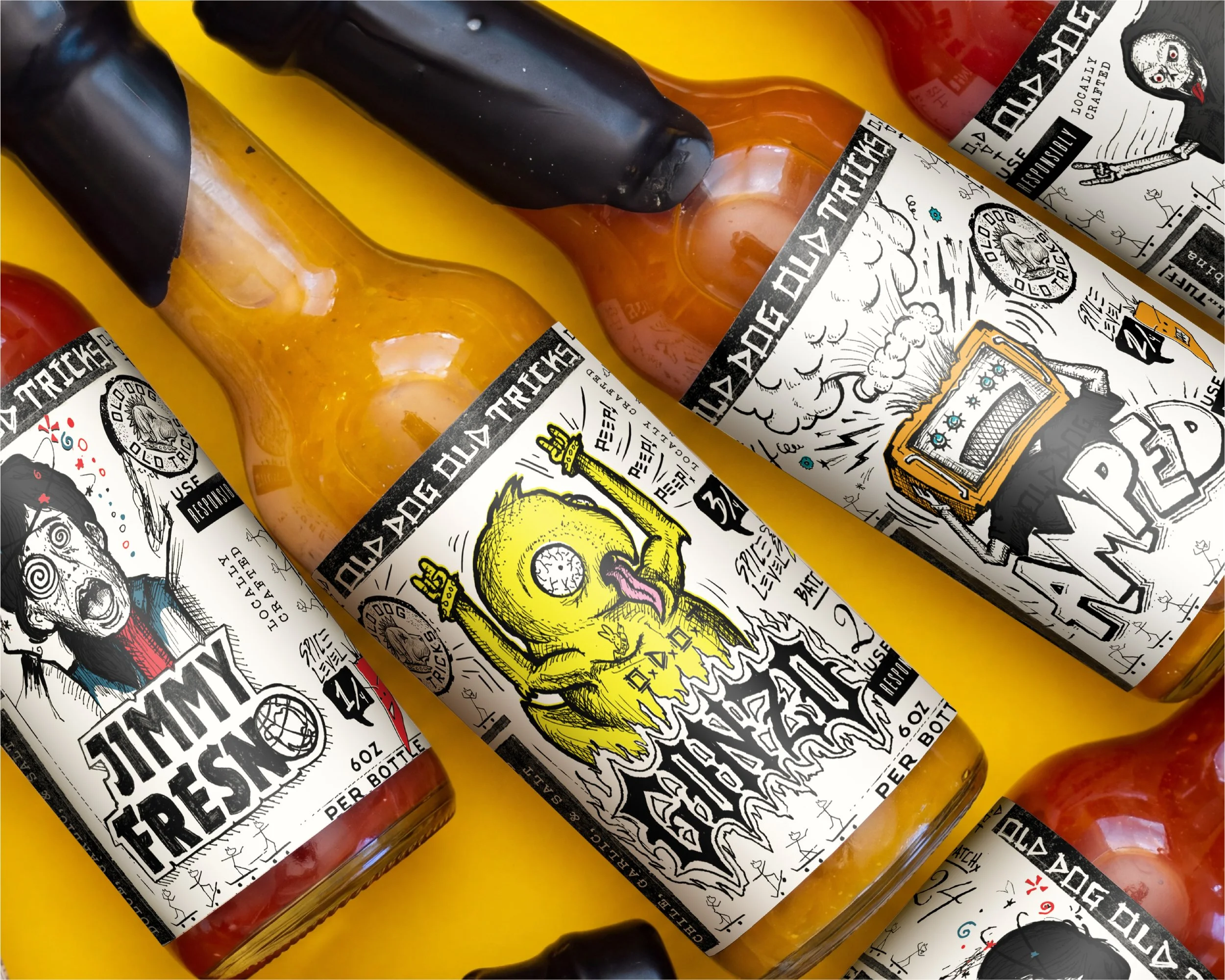
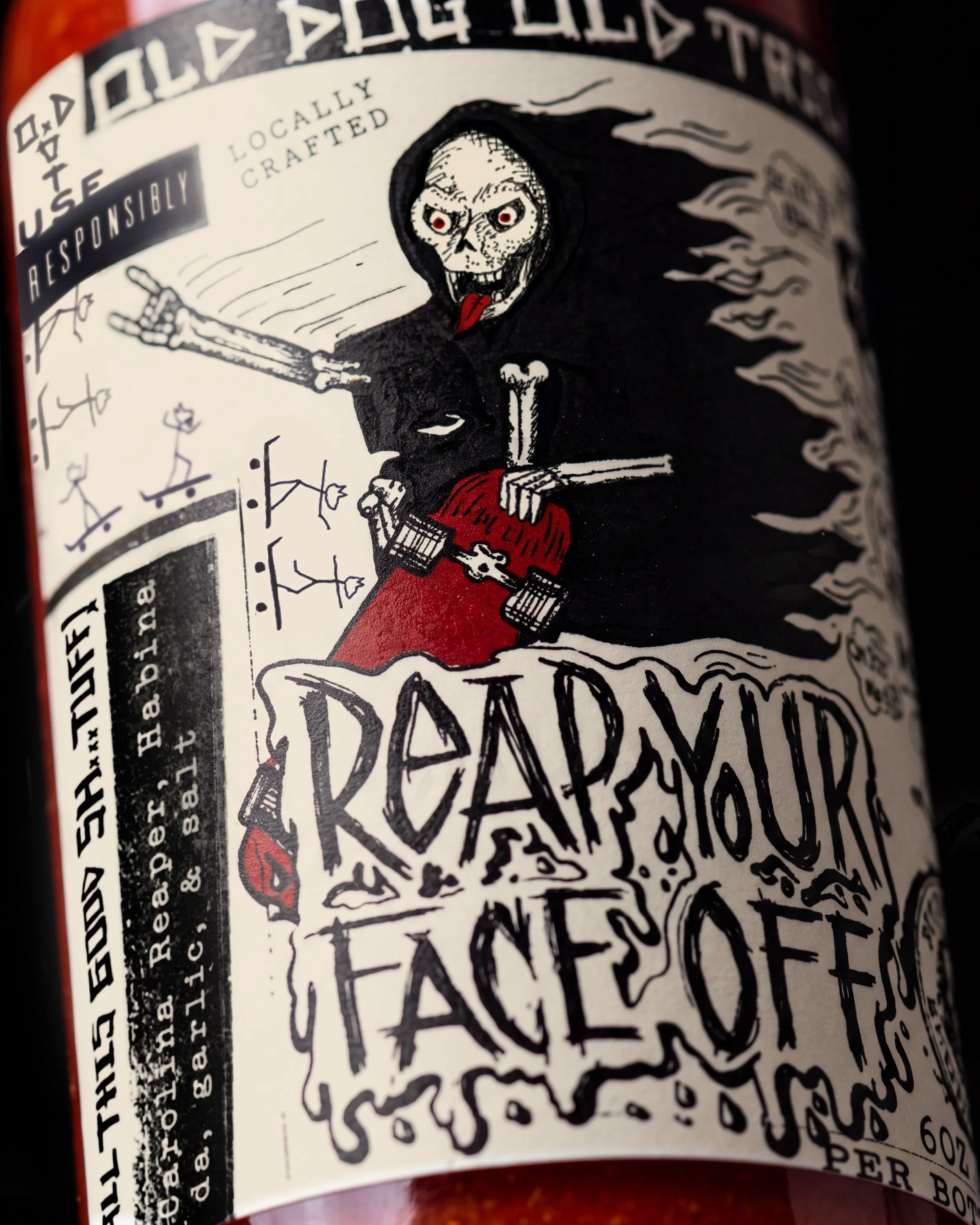
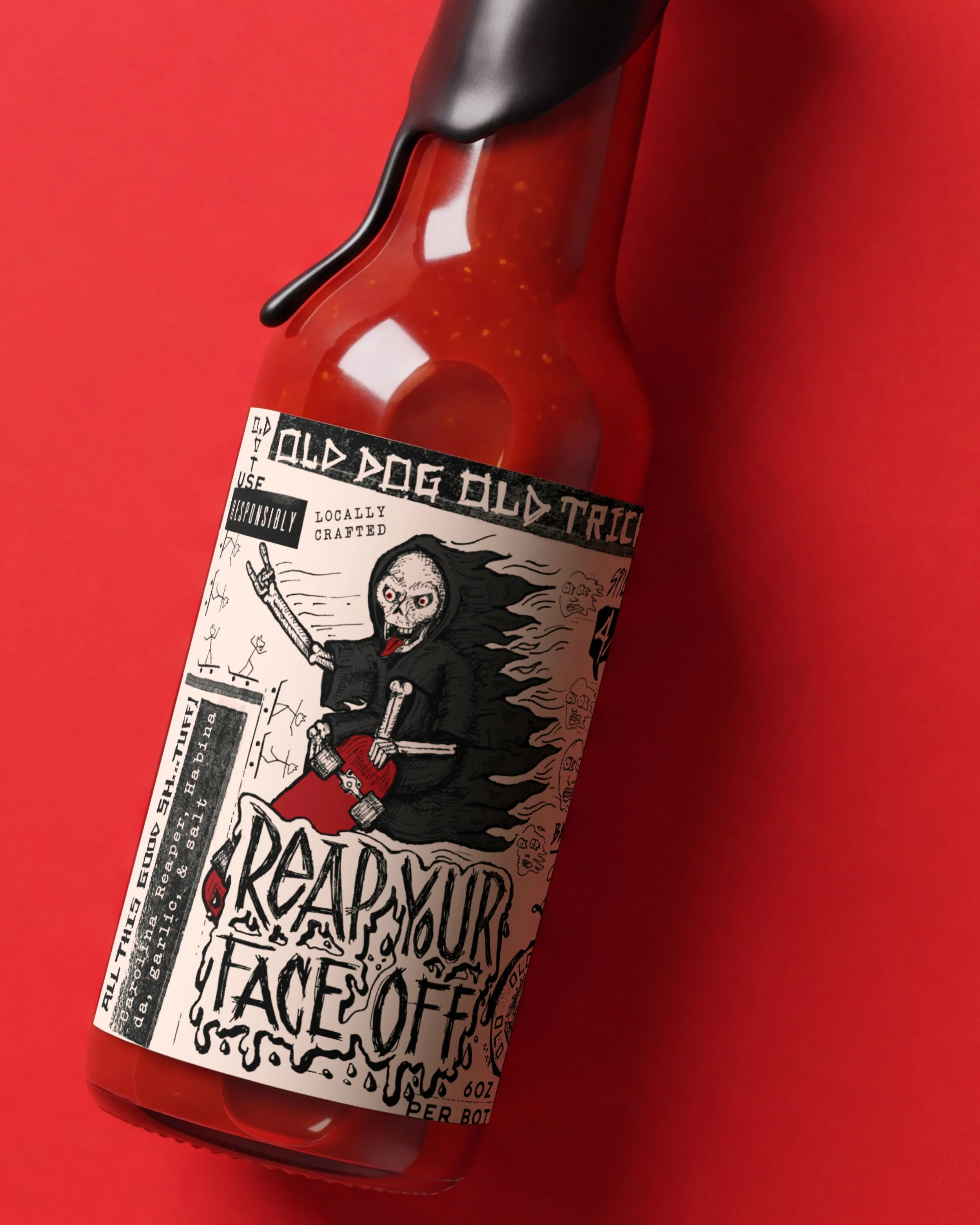
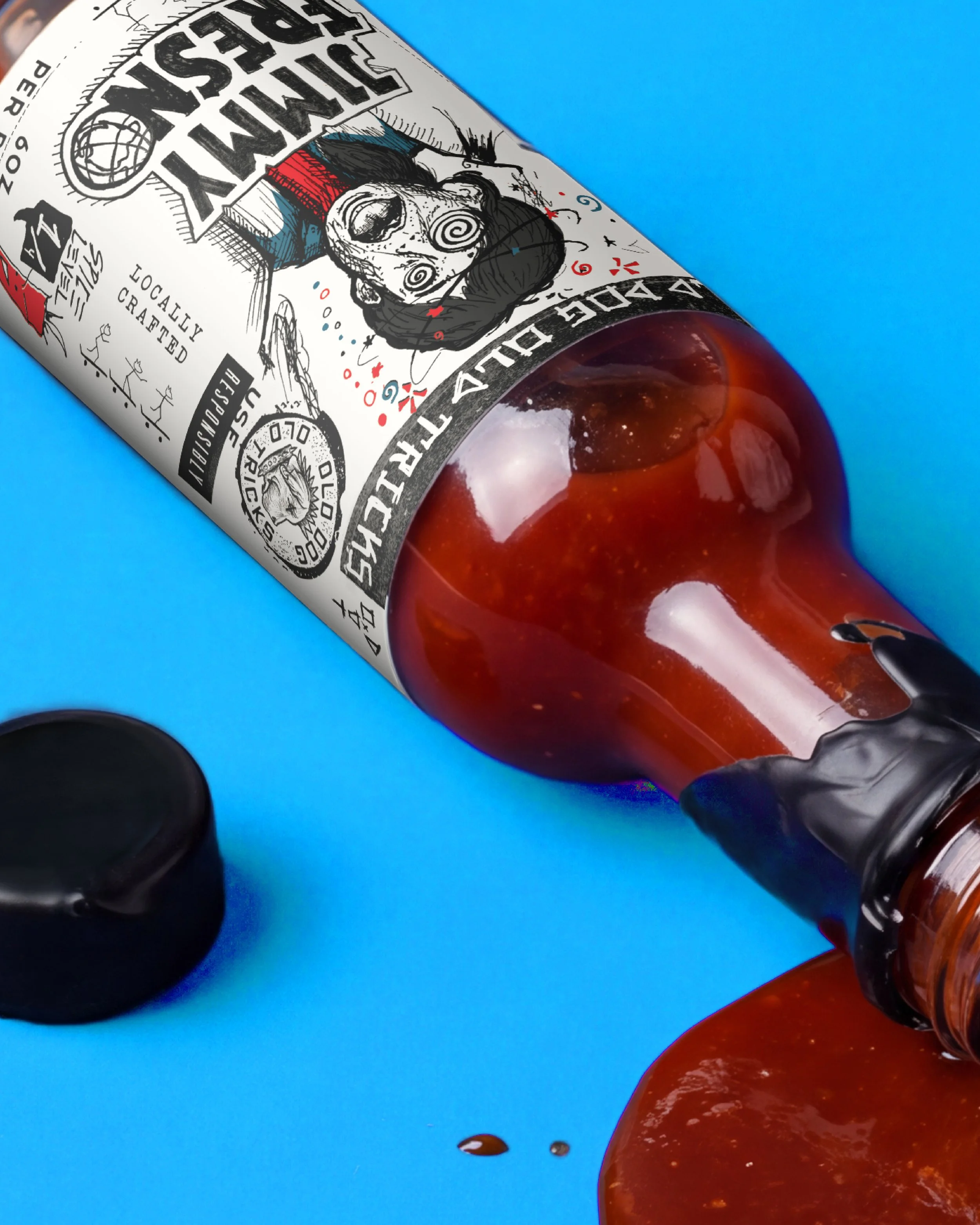
With names like Jimmy Fresno, Amped, Gonzo, and Reap Your Face Off, we had some pretty entertaining characters to work with.
Building on the names and offbeat ideas from the Old Dog team, we brought each sauce to life through original illustrations, giving every bottle a personality as distinct as what’s inside. From a thoroughly partied-out Jimmy Fresno at a relatively tame 1/4 on the heat scale to a skateboarding Grim Reaper bringing the full 4/4, there’s a little something for everyone. Depending, of course, on your tolerance for pain.
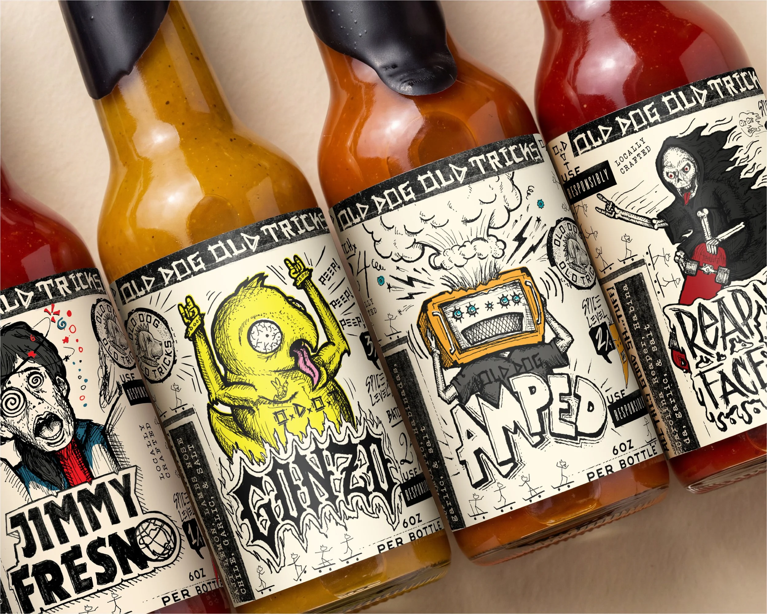
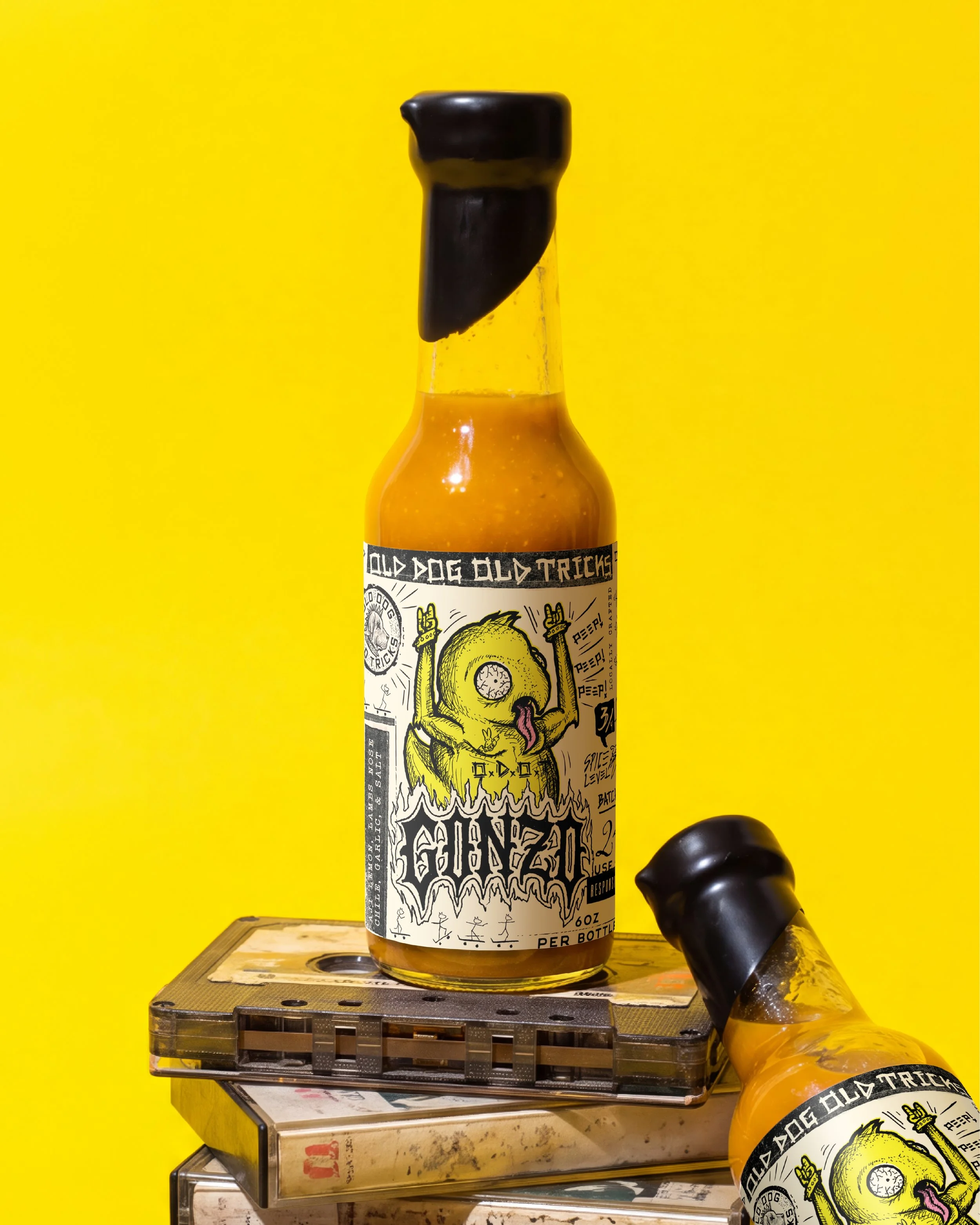
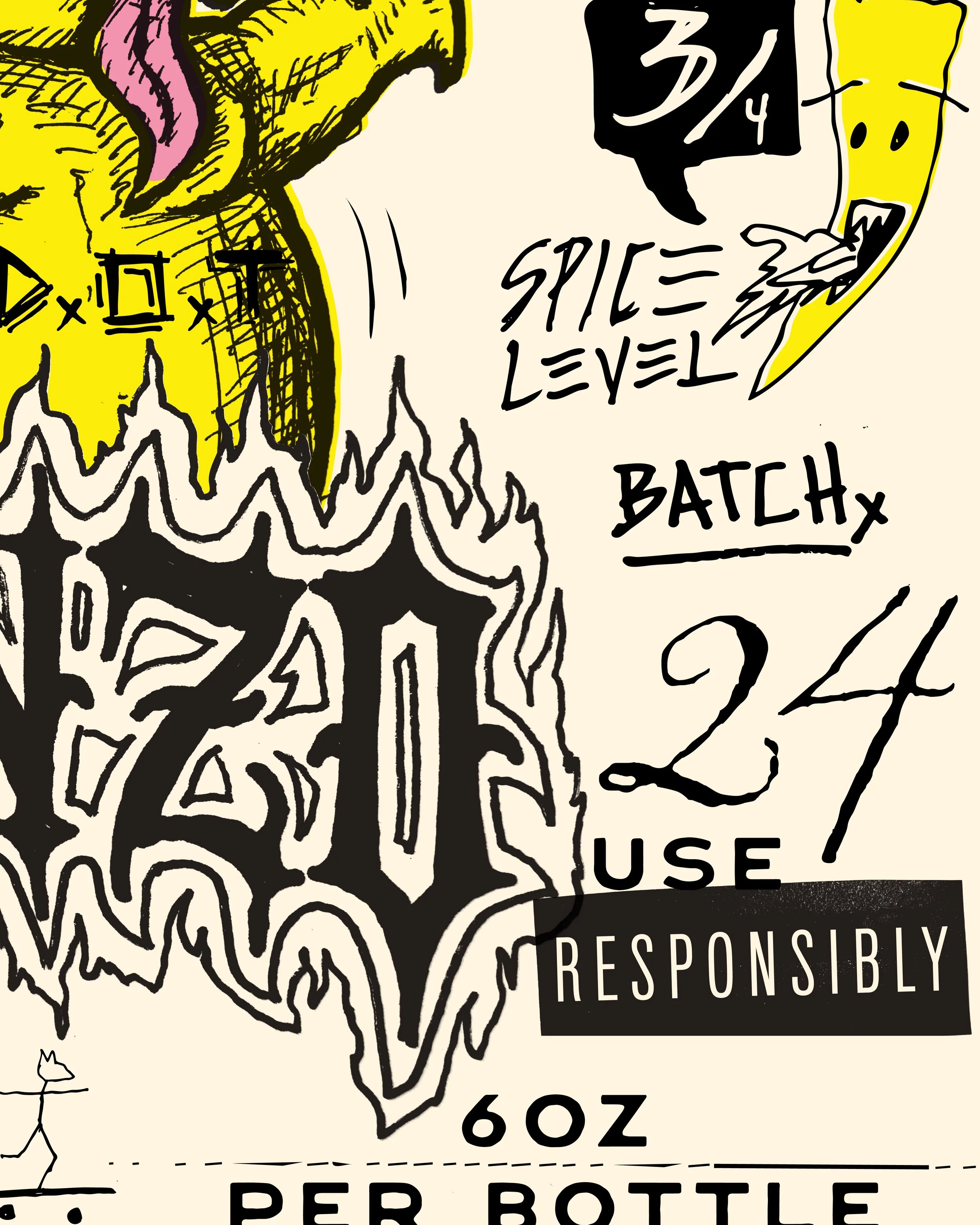
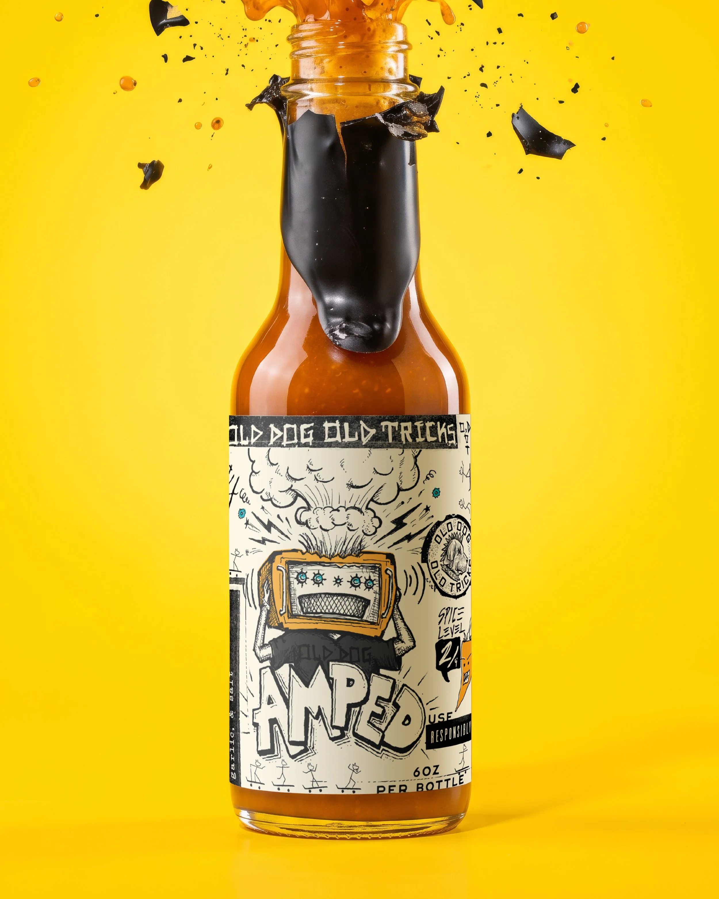
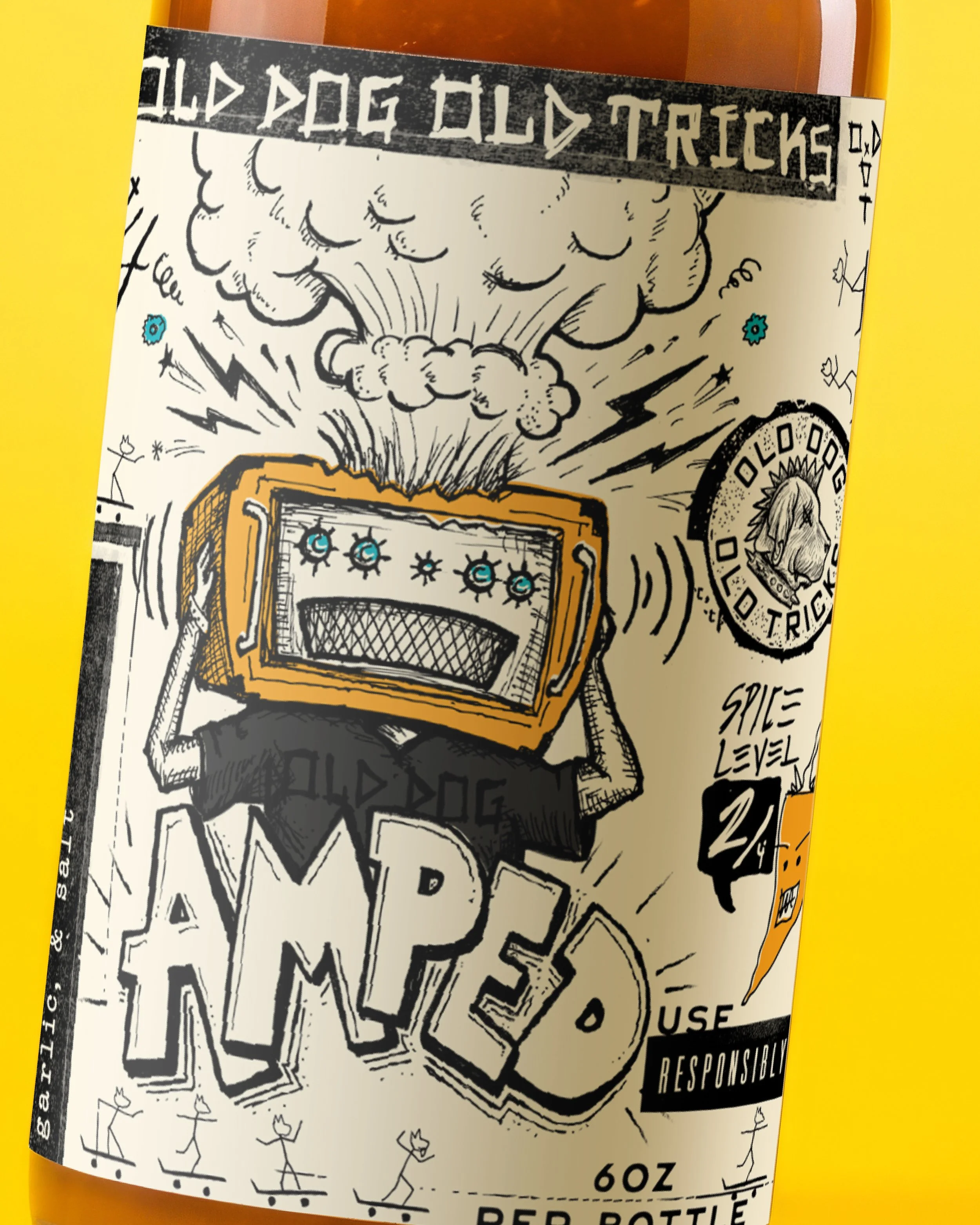
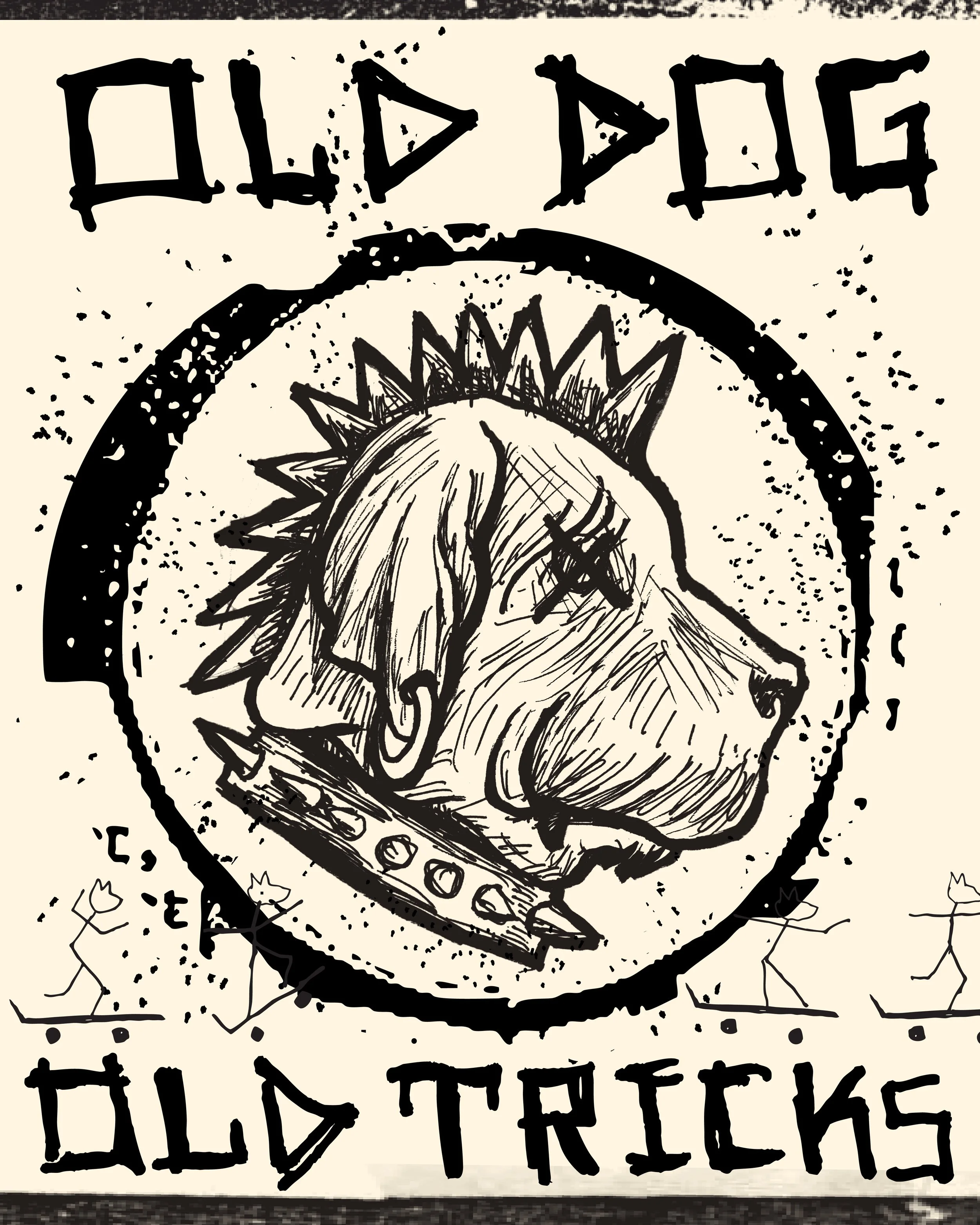
Beyond the characters and custom lettering, we filled each label with illustrated spice-level scales, tiny stick-figure skateboarders, scattered doodles, and a whole lot of visual mischief. Not even the Old Dog logo escaped the drawing board. Every last detail was worked up by hand before being prepared for print. And because we’re in Napa, each bottle gets a finishing touch borrowed from wine country: a wax top. It’s a lot of careful work for something meant to look this unhinged.
