
Coturnix
BRANDING, ILLUSTRATION, PACKAGE DESIGN
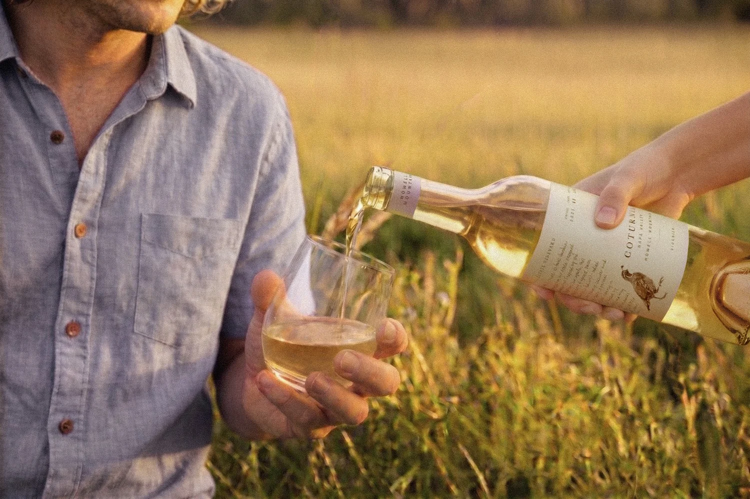
Coturnix is the inaugural wine label from M&M Harvests, a small-production, family-owned brand rooted on Howell Mountain in Napa Valley. For Molly Blakeley and Miles Prim, the project began with a simple ambition: to create something personal—wines that reflect both their estate and the shared experiences that surround it.
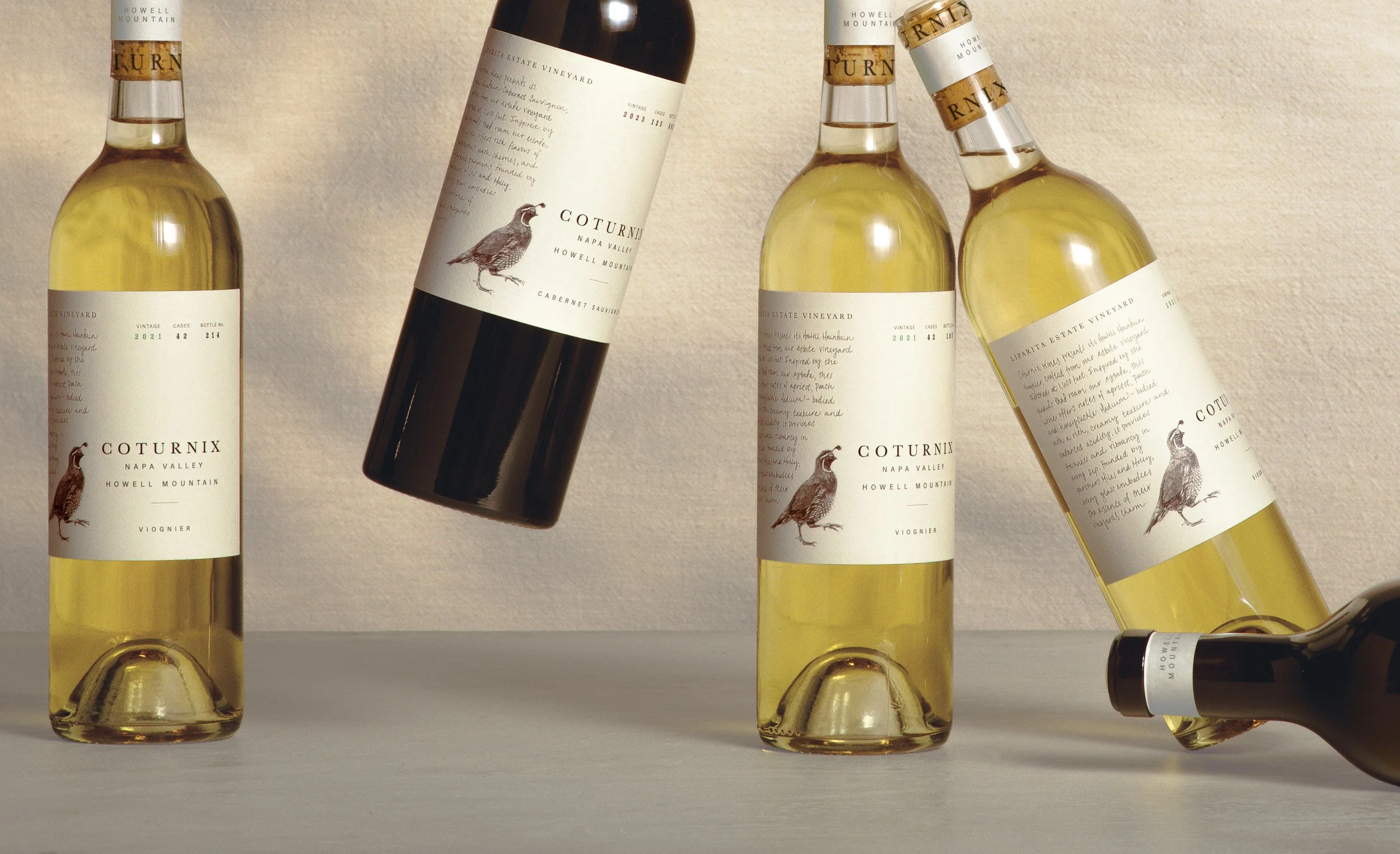
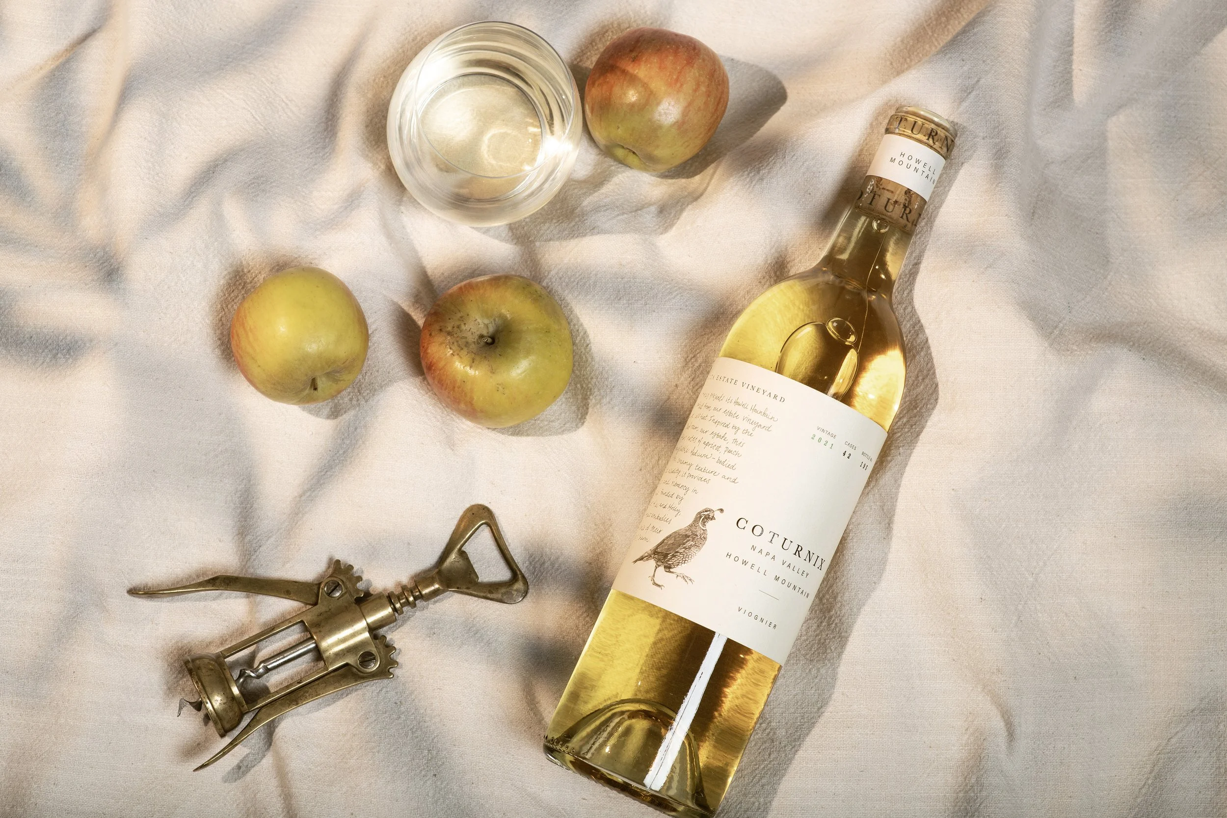
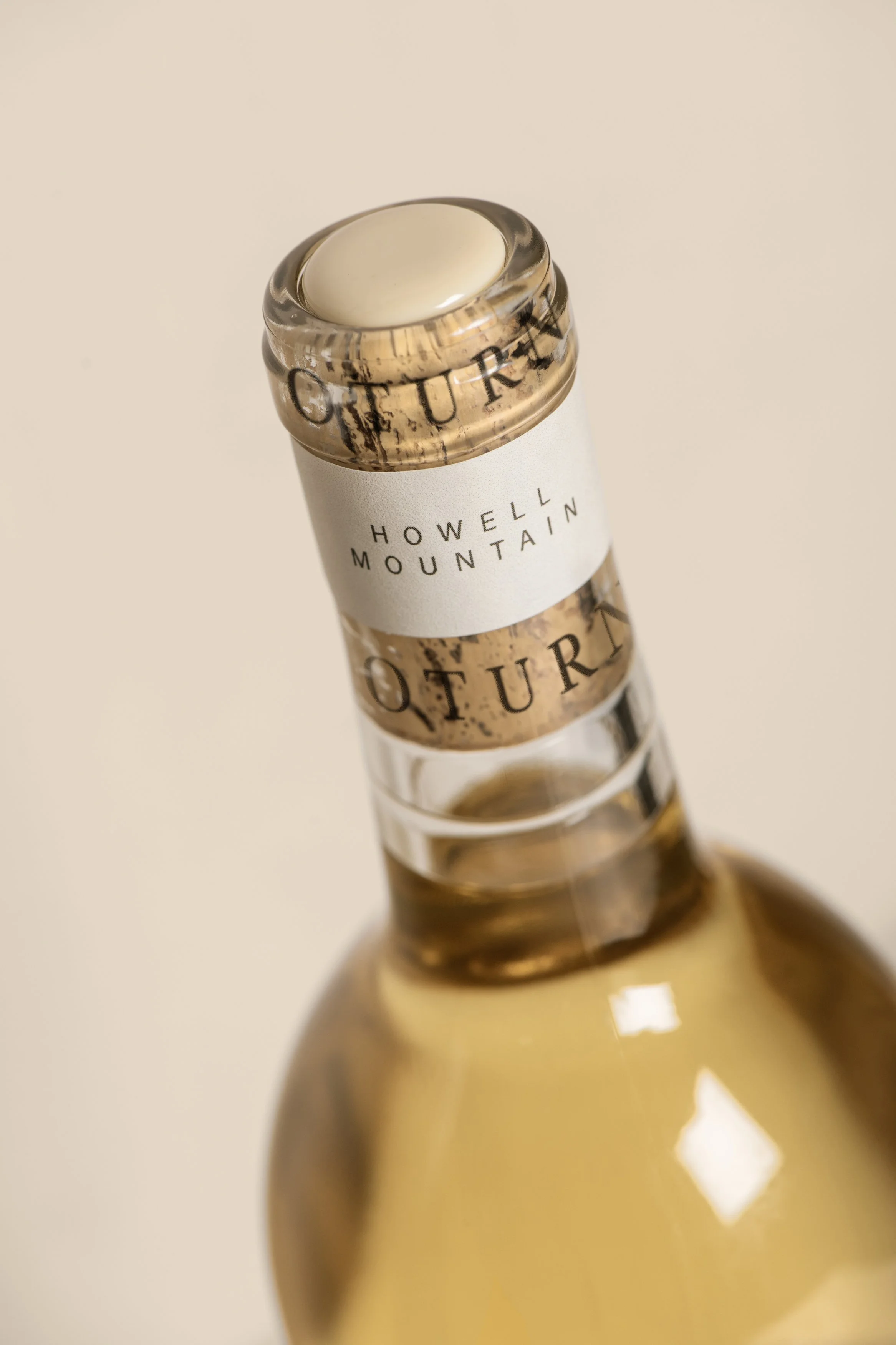
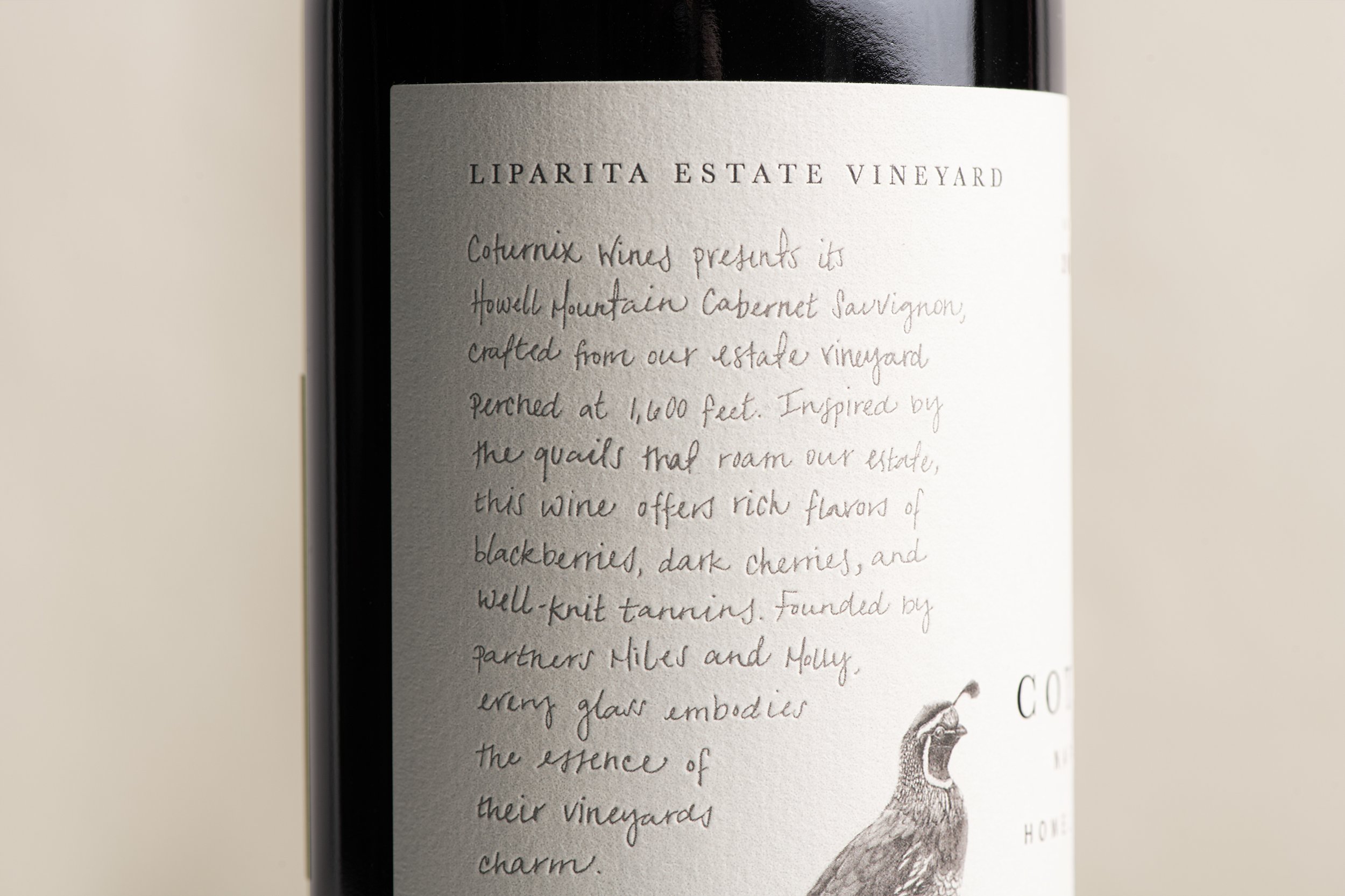
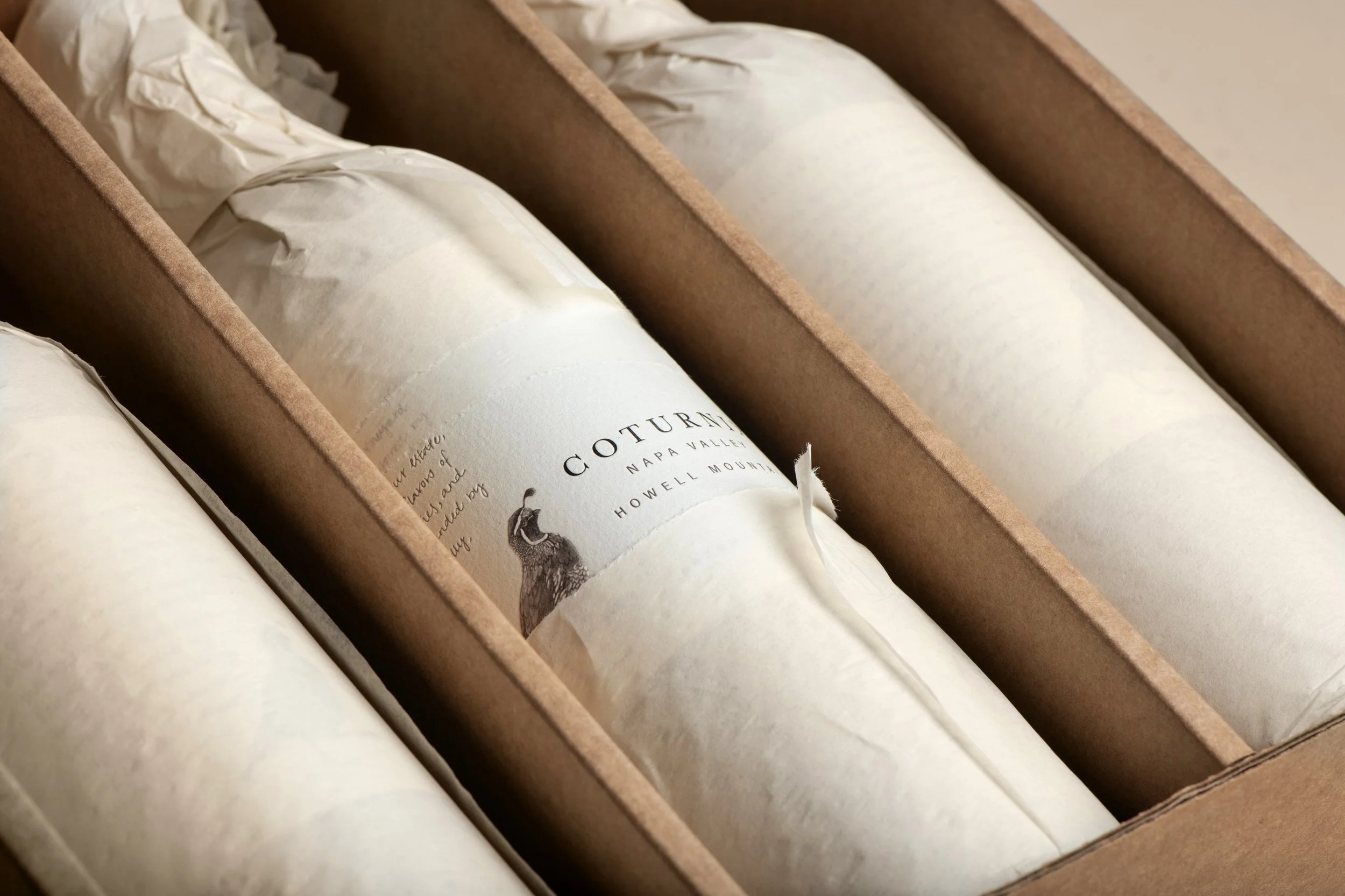
Named after the quail that roam their Howell Mountain property, Coturnix grounds the brand firmly in place. We developed a packaging system that feels quiet and considered, balancing refinement with warmth. Anchored by a detailed quail illustration and restrained typography, the label draws from the land itself—subtle in expression, but unmistakably tied to its origin. An elegant, minimal neck label and a simple wax top detail extend that restraint upward, creating a cohesive silhouette that feels both classic and distinctly their own.
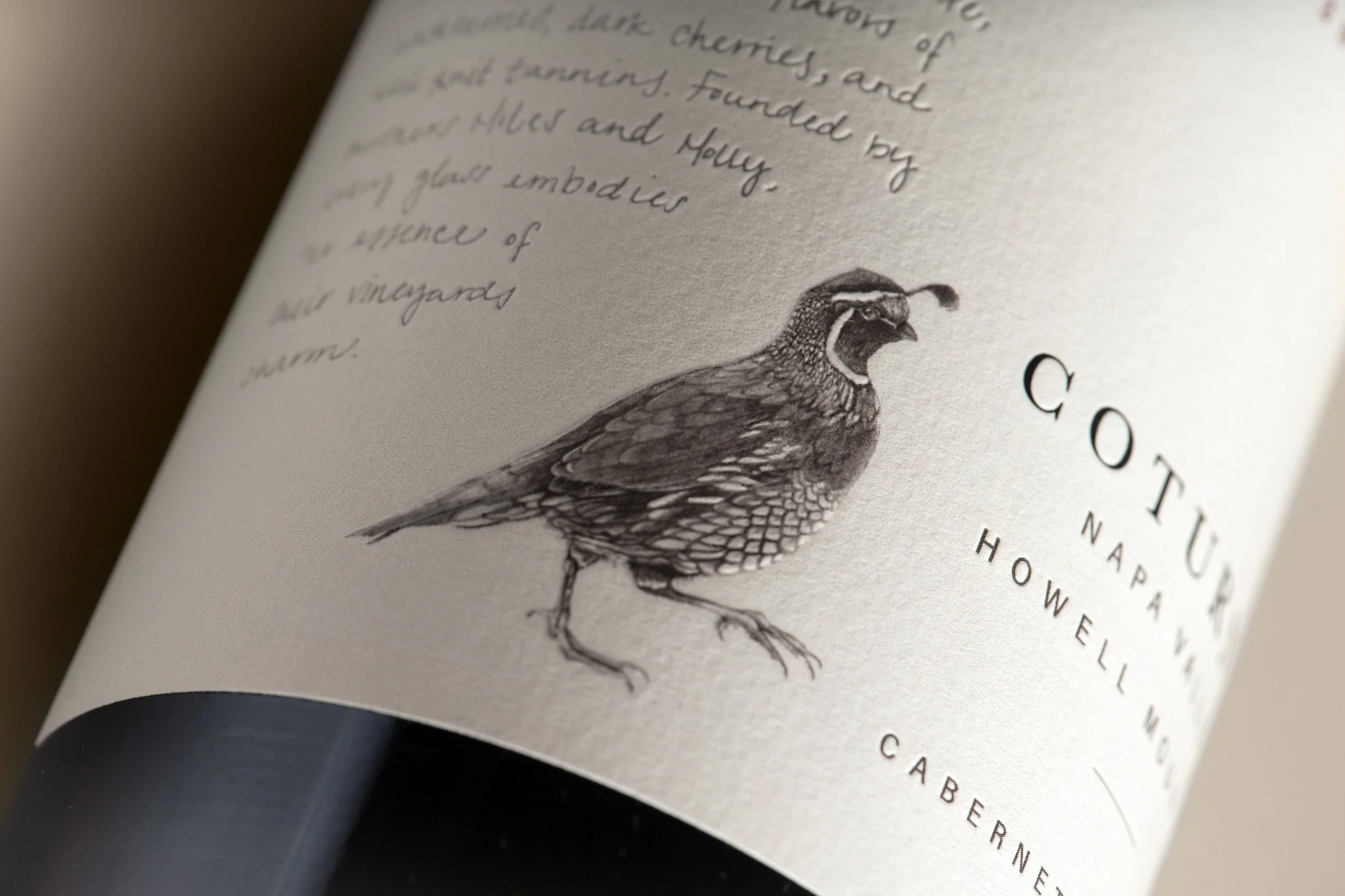
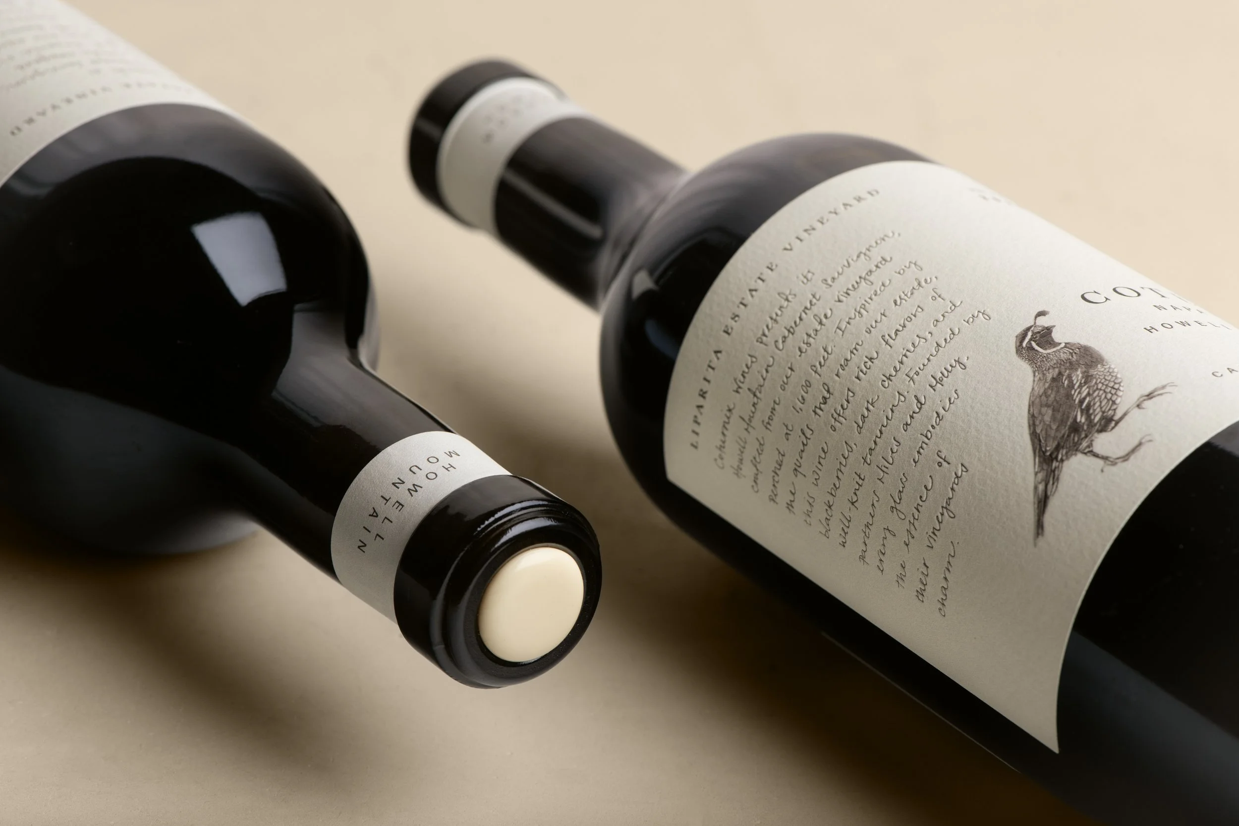
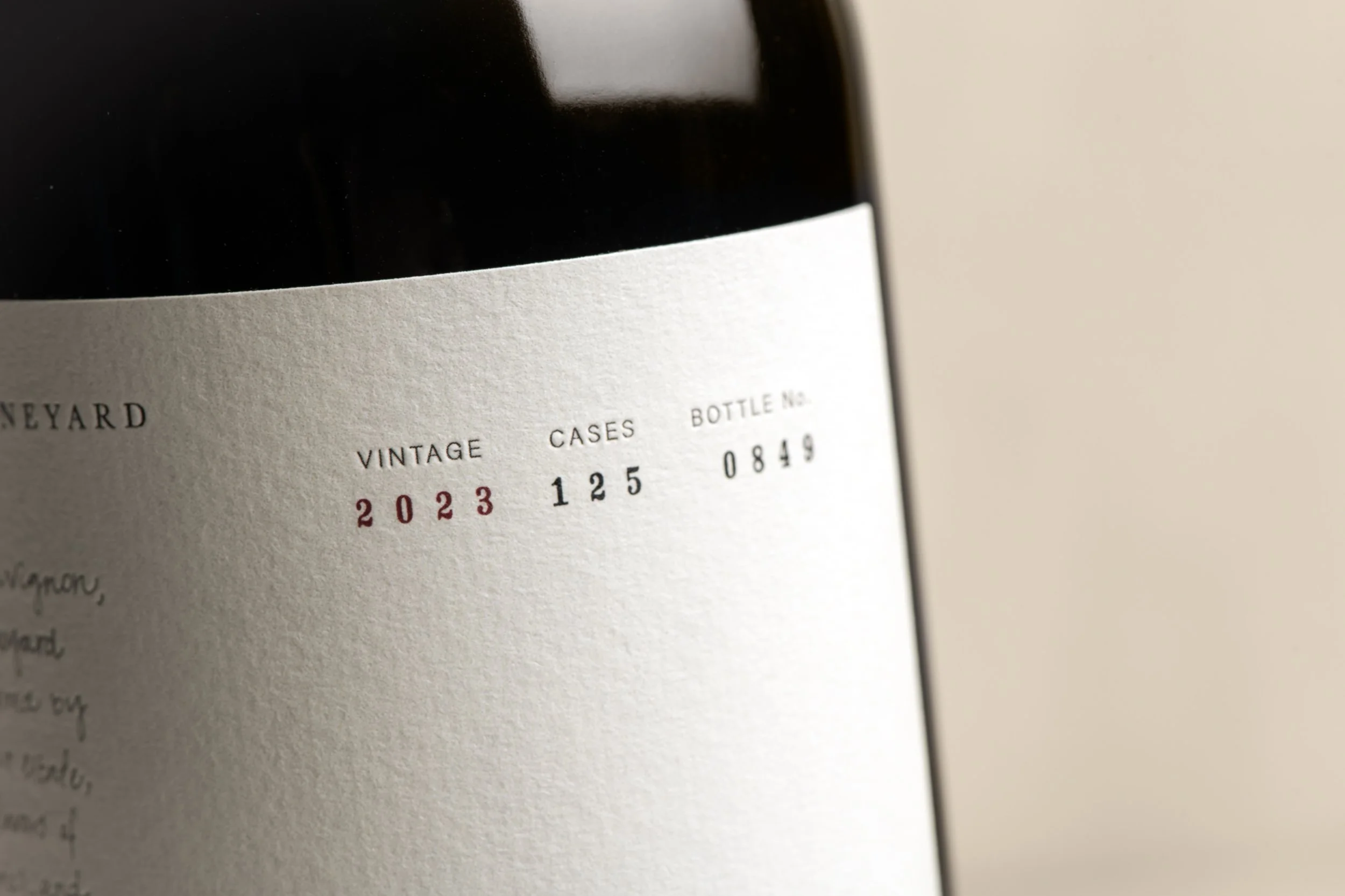

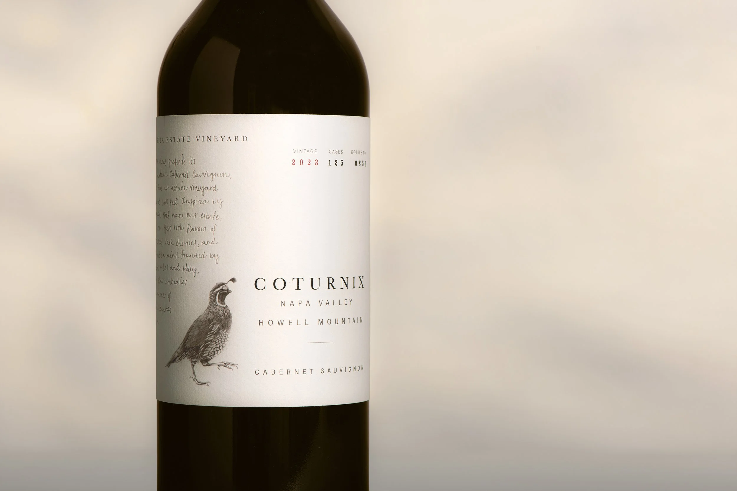
Guided by a “less is more” philosophy, the system relies on materiality and detail to carry the story. Soft, textured stock, muted tones, and delicate typographic gestures create a sense of craftsmanship that mirrors the wines themselves—homegrown, small-batch, and intentionally made. The label features romance copy translated directly from Molly’s own handwriting, reinforcing the personal nature of the brand in a way that feels intimate rather than overt.
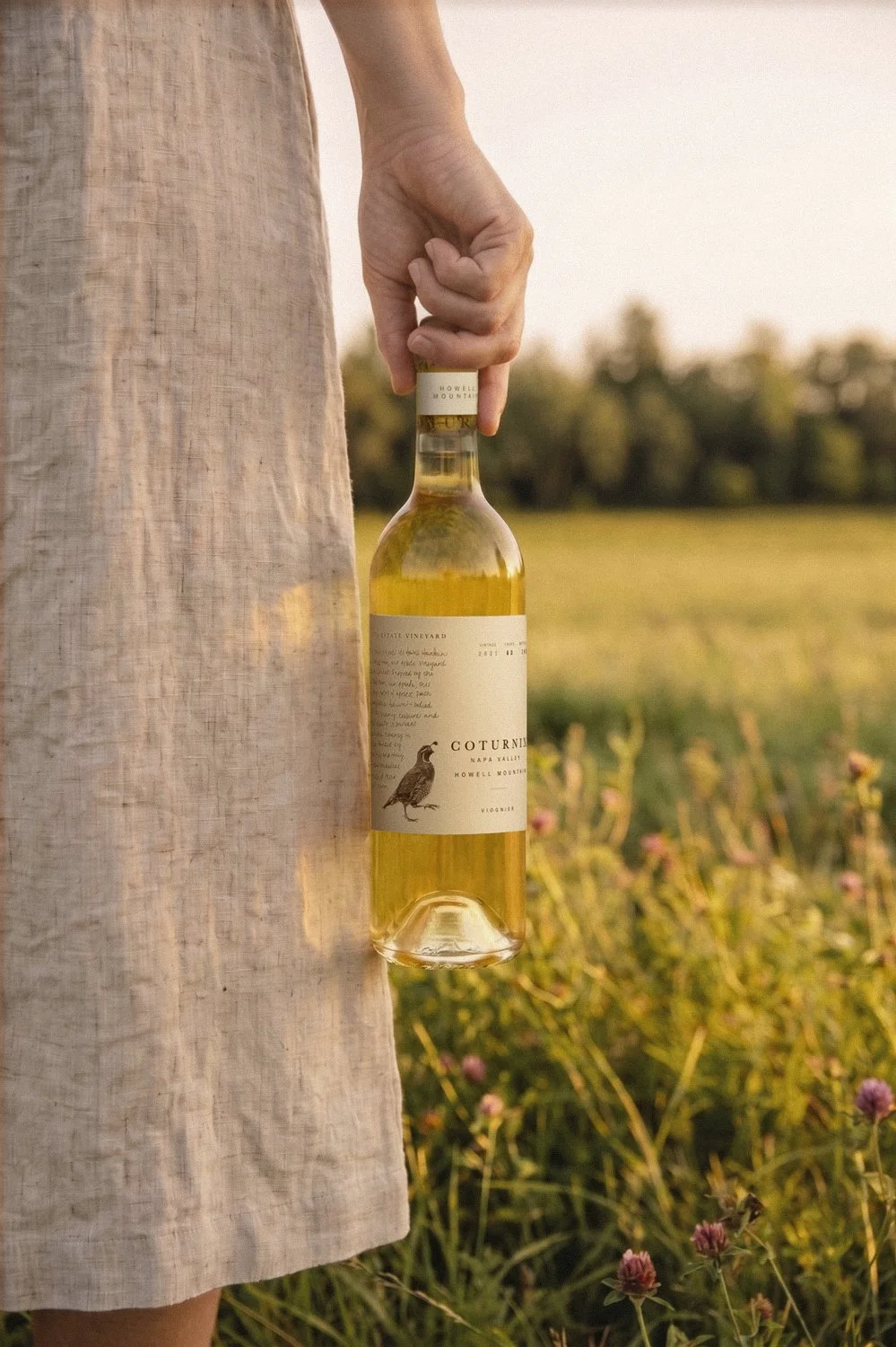
The visual language was designed to extend beyond the bottle—translated into custom boxes, business cards, and signage to create a cohesive, lived-in brand world. Each element feels considered but unfussy, allowing the packaging to move seamlessly from shelf to table. A quiet presence that supports the moments it’s part of, rather than competing with them.
Photography: George E. Baker Jr.