

B. Kosuge
PACKAGE DESIGN
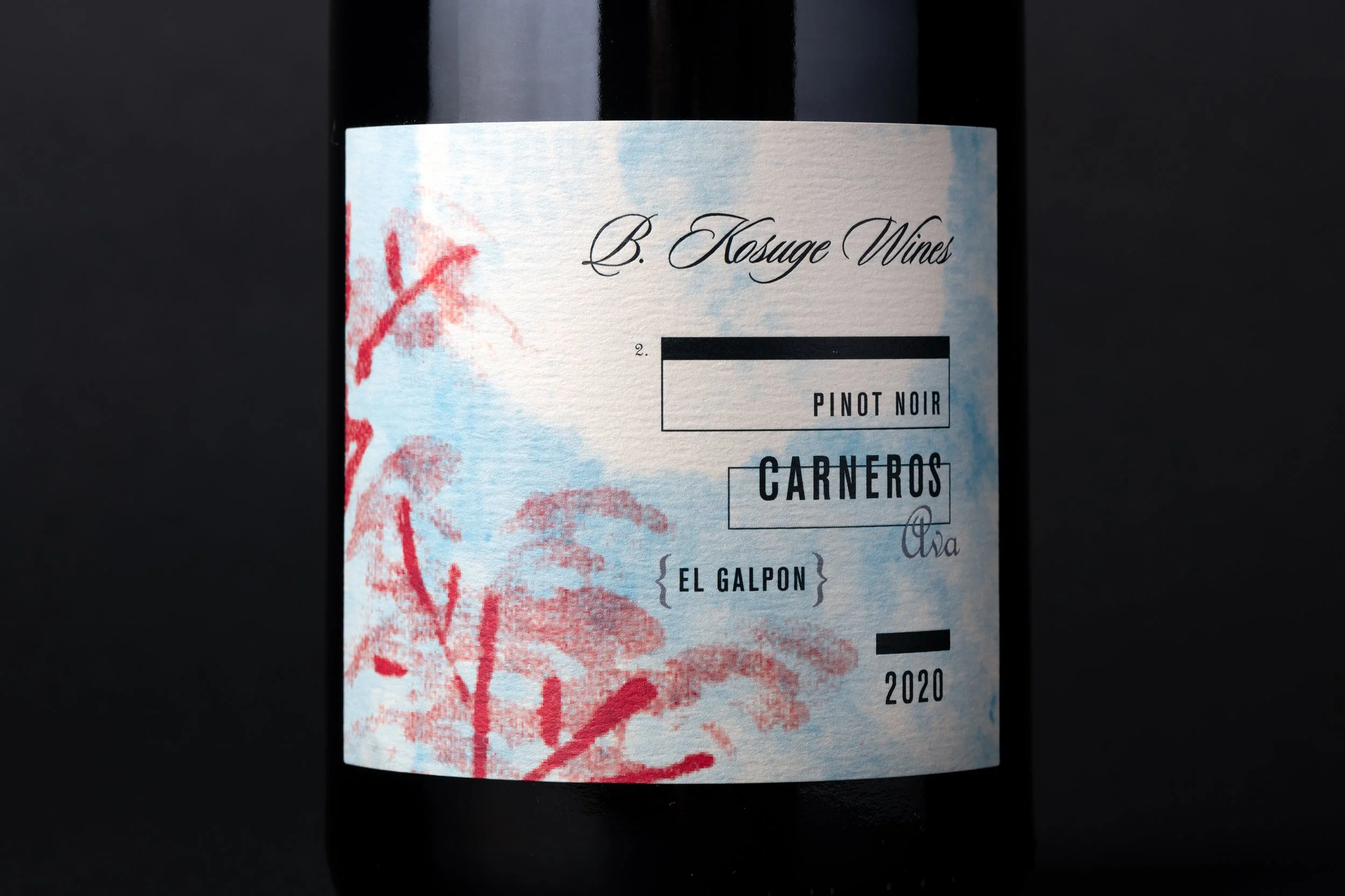
Winemaker Byron Kosuge brings a deeply reflective nature to his craft, balancing seemingly opposing forces in every bottle: serious yet fun, pretty yet functional, unusual yet approachable. These contrasts served as inspiration for a distinctive branding and packaging solution that reflects the nuanced artistry of his wines.
The label design draws on Kosuge’s Japanese heritage through a collage of manipulated heirloom tapestry photos, creating a rich and textured background. The juxtaposition of institutional sans-serif type set in form boxes with delicate script typography enhances the balance of structure and elegance. A vibrant palette of saturated colorways unites the offerings into a cohesive yet varied family. Much like the wines themselves, the packaging is layered, thoughtful, and delightfully unexpected.


Photography: George E. Baker Jr.